
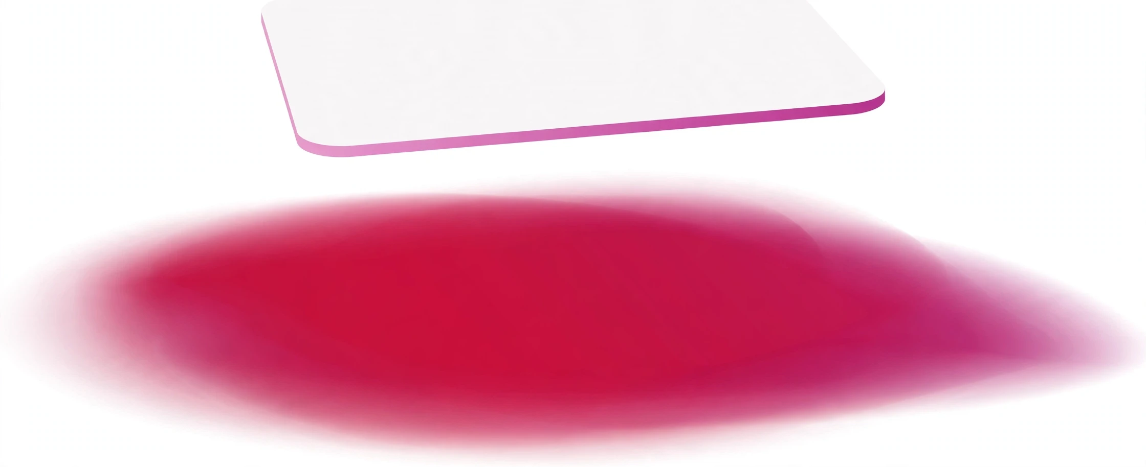
Offsets, blur and spread are in pixels. Negative offsets move the shadow up or left; a negative spread shrinks it. A blur radius cannot be negative — it is set to 0 if you enter one. Opacity below 100% makes the shadow see-through. An inset shadow falls inside the box instead of outside it.
What is the CSS Box Shadow Generator?
A CSS box shadow generator is a visual tool that builds the box-shadow property for you. You drag sliders for the offset, blur, spread and colour, watch the shadow appear on a card in the live preview, and copy the finished CSS. No guessing numbers, no refreshing the page to see what changed.
Shadows are what make flat boxes look like real objects. A soft shadow lifts a card off the page; a hard shadow makes a button look pressed; an inset shadow carves a hollow into a panel. The CSS for a shadow is a single line, but getting the numbers right by hand is fiddly — a blur of 12 pixels looks gentle, a blur of 40 looks like fog, and the difference between them is not obvious until you see it. That is the problem this free CSS box shadow generator solves: you see every change as you make it.
The tool is for anyone building a website — beginners learning CSS, designers testing a card style, and developers who want a shadow without trial and error. It runs entirely in your browser. There is no sign-up, nothing is uploaded, and the colours you pick never leave your device.
How to use the CSS Box Shadow Generator
The tool sits at the top of this page. The controls are on the left and the live preview with the generated CSS is on the right. Follow these steps:
- Pick a starting point. Click one of the presets: Soft, Card, Lifted, Inner, Double or Crimson glow. The tool loads with the Soft preset, so you can see a gentle shadow straight away.
- Set the offsets. Each shadow has a “Horizontal offset (px)” and a “Vertical offset (px)”. These move the shadow sideways and downwards. Positive values push it right and down; negative values move it up or left. A vertical offset of 4 pixels with a horizontal offset of 0 gives the classic “floating card” look.
- Set the blur and spread. “Blur radius (px)” softens the shadow’s edge — 0 gives a hard edge, higher values give a softer one. A blur radius cannot be negative; if you enter one, it is set to 0. “Spread radius (px)” grows or shrinks the shadow: positive values make it bigger, negative values shrink it.
- Pick the colour and opacity. Choose a colour for the shadow — usually black — and set its opacity. Opacity below 100% makes the shadow see-through, which is what makes a shadow look soft and realistic instead of like a grey slab. Black at 15% opacity is a good default for a light page.
- Try inset. Tick “Inset (inside the box)” and the shadow falls inside the box instead of outside it. Inset shadows are good for pressed buttons, input fields and hollow panels.
- Add another shadow. Click “Add a shadow” to layer a second shadow on the same box — you can have up to five. Layering a small, sharp shadow under a large, soft one is how designers get depth that a single shadow cannot give. Each shadow has its own remove button.
- Copy the CSS. Click “Copy CSS” to copy it to the clipboard, or “Download CSS” to save it as a file. “Clear” empties the output and “Reset” restores the Soft preset.
Worked example: a soft card shadow
Say you want the standard soft shadow used on most modern cards. Click the Soft preset. The preview shows a card with a gentle shadow underneath, and the Generated CSS box reads:
box-shadow: 0px 4px 12px 0px rgba(0, 0, 0, 0.15);
Read it left to right: no horizontal offset, 4 pixels down, 12 pixels of blur, no spread, and black at 15% opacity. Paste it into your card class:
.card {
  background: #ffffff;
  border-radius: 8px;
  box-shadow: 0px 4px 12px 0px rgba(0, 0, 0, 0.15);
}
Adjust the opacity or blur a little at a time — small changes matter, and the preview updates as you drag.
Where to use box shadows
Cards and panels. This is the most common use. A card with a soft shadow reads as a separate object sitting on the page, which helps visitors scan a grid of articles, products or profiles. Keep the shadow subtle — black at 10 to 20% opacity, a few pixels down, 8 to 16 pixels of blur. A shadow that is too dark or too large stops looking like depth and starts looking like a smudge.
Buttons and hover states. A button can have a small shadow at rest and a bigger one on hover, which makes it feel like it lifts towards you when the mouse arrives. Try the Card preset at rest and the Lifted preset on :hover, and add a short transition so the change is smooth rather than sudden. The tool’s presets are a good starting point for both states.
Modals and dropdowns. Anything that floats above the page — a dialog box, a dropdown menu, a tooltip — needs a stronger shadow than a card, because it sits further above the surface. The Lifted preset (10 pixels down, 30 pixels of blur, 20% opacity) is a good base, and the Double preset layers a small sharp shadow under a large soft one for extra depth.
Tips for better shadows
Use black with low opacity, not grey. A shadow made from solid grey looks flat and dirty. Black at 10 to 20% opacity lets the page colour show through, so the shadow feels like real shade. On a dark page, try white at low opacity instead — a dark shadow is invisible on a dark background.
Keep the blur bigger than the offset. When the blur radius is smaller than the vertical offset, the shadow looks like a hard copy of the box sitting behind it. When the blur is two or three times the offset, the shadow softens into something that reads as depth. The Soft preset follows this rule: 4 pixels down, 12 pixels of blur.
Layer two shadows for depth. One shadow gives you one edge; two give you a sharp contact shadow close to the box and a soft ambient shadow further out. The Double preset does this: a tight shadow (1 pixel down, 3 pixels of blur, 12% opacity) plus a wide one (8 pixels down, 24 pixels of blur, 18% opacity). Layering is the single biggest improvement you can make to a flat-looking shadow.
Use inset sparingly. Inset shadows darken the inside edges of a box, which reads as a hollow or a pressed state. They work well on input fields and pressed buttons, but an inset shadow on a whole card makes the card look sunken and tired. One inset shadow is usually enough.
Frequently asked questions
What do the four numbers in a box shadow mean?
A box shadow is written as offset-x, offset-y, blur and spread, then the colour. box-shadow: 0px 4px 12px 0px rgba(0, 0, 0, 0.15); means: no sideways offset, 4 pixels down, 12 pixels of blur, no spread, black at 15% opacity. The tool writes this line for you, in exactly this order.
What is the difference between blur and spread?
Blur softens the shadow’s edge — higher blur makes the edge fade out gradually. Spread changes the shadow’s size — positive spread makes the whole shadow bigger, negative spread shrinks it. A shadow with a large blur and no spread looks soft; a shadow with no blur and a large spread looks like a solid border behind the box.
What does inset do?
Without inset, the shadow falls outside the box, as if the box is casting shade on the page. With inset, the shadow falls inside the box, as if light is coming from above a hollow. Inset shadows are used for pressed buttons, input fields and panels that should look carved in rather than raised up.
Can I use more than one shadow on the same element?
Yes. CSS allows a comma-separated list of shadows, and the browser draws them all. This tool lets you add up to five shadows to one box, and the generated CSS joins them with commas. Layering a small sharp shadow with a large soft one is the standard technique for realistic depth.
Will the shadow work in all browsers?
Box shadow is supported by every modern browser, including Chrome, Firefox, Safari and Edge. There is no prefix or fallback needed. The only thing to watch is very old browsers — anything from before 2011 — which ignore the property and simply show no shadow, which is a safe failure.
Conclusion
A good shadow is almost invisible: visitors notice the depth, not the shadow itself. Build yours above with the CSS Box Shadow Generator, starting from a preset and adjusting until the card feels right. If you want to round the corners of the box you are shadowing, the CSS Border Radius Generator on this site will give you the matching border-radius in the same way.