Mastering HTML Details and Summary Tags: The Complete Guide to Toggleable Content
Modern web design is all about interaction and simplicity — giving users just what they need, when they need it. One of the simplest yet most powerful ways to achieve this is by using the HTML details and summary tags. These HTML5 elements allow developers to create toggleable, expandable, and collapsible content without any JavaScript. From FAQs and documentation sections to product specs and terms & conditions — they make content dynamic, user-friendly, and SEO-rich.
In this ultimate guide, you’ll learn everything about HTML details and summary tags — what they are, how to use them, how they affect SEO and accessibility, and how to style them for better design control. Let’s dive deep into how these simple HTML elements can make your web pages more interactive and engaging.
Table of Contents
- Introduction to HTML Details and Summary Tags
- Syntax and Basic Usage
- How Details and Summary Work Together
- Styling HTML Details and Summary with CSS
- Enhancing Toggleable Content with JavaScript
- Top Use Cases for HTML Details and Summary Tags
- Accessibility and Best Practices
- SEO Benefits and Content Strategy
- Advanced Examples and Interactivity
- Performance Benefits of Native HTML Toggleable Content
- ❌ Common Mistakes to Avoid
- Browser Compatibility and Fallbacks
- Conclusion
- Frequently Asked Questions
1. Introduction to HTML Details and Summary Tags
The HTML details and summary tags were introduced in HTML5 to simplify how we create collapsible content. Before their introduction, developers relied heavily on JavaScript to show or hide sections of a webpage. Now, you can add interactive, toggleable sections using just HTML.
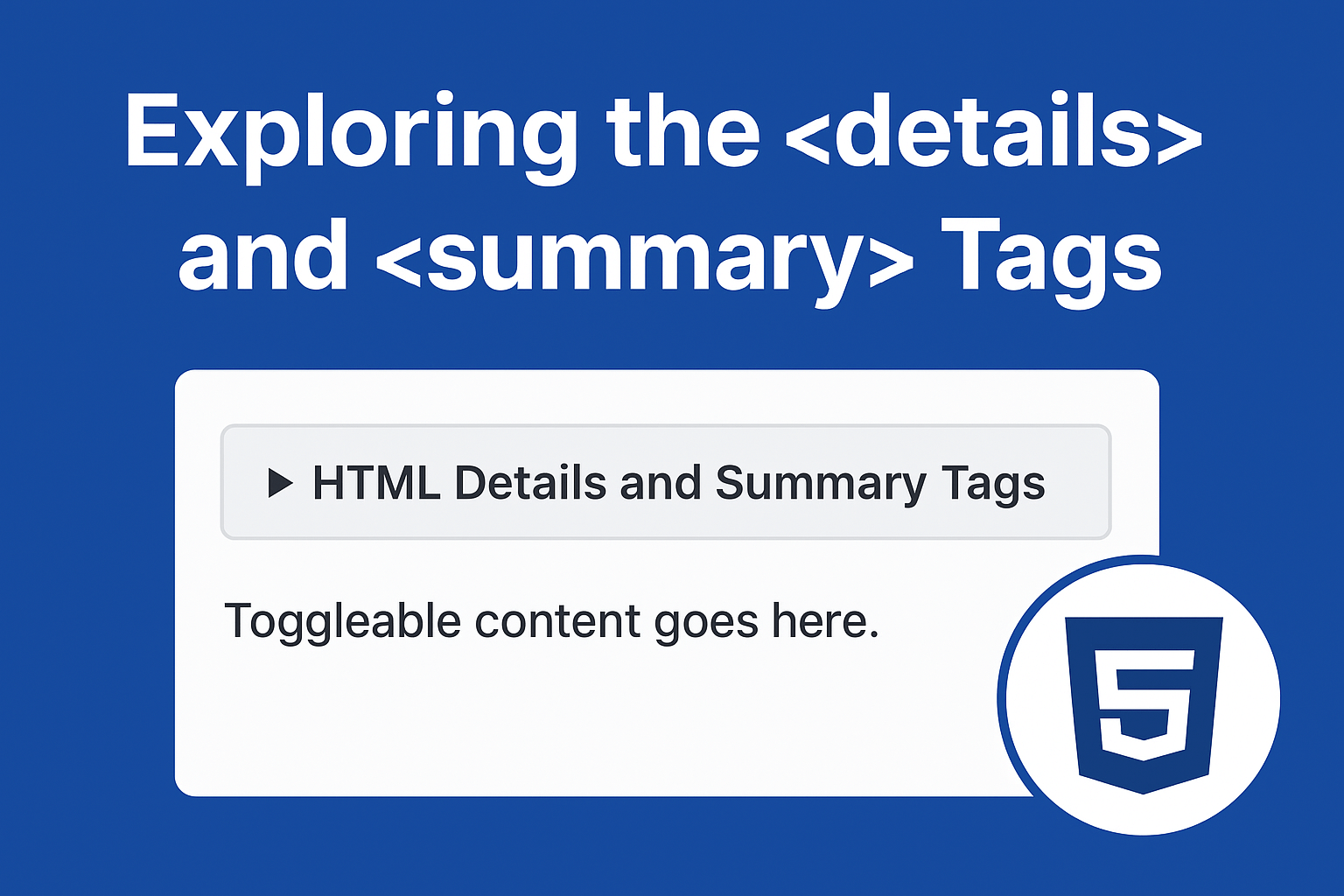
The <details> tag acts as a container that can hold hidden content, while the <summary> tag acts as the clickable header or label that expands and collapses the section.
In short, these tags allow developers to create cleaner markup, improve accessibility, and deliver better performance by avoiding unnecessary scripts.
🧠 Why You Should Use HTML Details and Summary Tags
✅ Simplicity
It’s native HTML—no scripts or external dependencies.
♿ Accessibility
Screen readers and assistive devices can interpret these elements as interactive components.
🌐 SEO-Friendly
Search engines understand semantic HTML elements better, enhancing indexing and visibility.
⚡ Performance
By using native HTML tags instead of JS, you reduce render-blocking scripts, improving page speed and Core Web Vitals.
💬 Better UX
Users can expand what they need, leading to shorter visible content and improved readability.
2. Syntax and Basic Usage
The structure is simple. Here’s how you create an expandable section using HTML details and summary tags:
<details>
  <summary>Click to reveal more information</summary>
  <p>This paragraph is hidden until the user clicks the summary.</p>
</details>
Click to reveal more information
This paragraph is hidden until the user clicks the summary.
Explanation:
<details>defines the container for toggleable content.<summary>defines the visible clickable summary.- The content inside
<details>becomes visible when the user toggles it open.
3. How Details and Summary Work Together
When the summary is clicked, the browser toggles an open attribute on the <details> element. You can also add this attribute manually if you want the section expanded by default:
<details open>
  <summary>Already expanded by default</summary>
  <p>The open attribute makes this section visible when the page loads.</p>
</details>
Already expanded by default
The open attribute makes this section visible when the page loads.
This built-in behavior saves time and ensures a smooth user experience, especially for FAQs and educational content.
4. Styling HTML Details and Summary with CSS
By default, the summary displays a small disclosure arrow and basic text formatting. But you can use CSS to make your HTML details and summary tags match your website’s design perfectly.
details summary {
  font-weight: 600;
  cursor: pointer;
  background-color: #f7f7f7;
  padding: 10px;
  border-radius: 6px;
}

details[open] summary {
  background-color: #e6f4ea;
}

details p {
  padding: 10px 15px;
  margin: 0;
  border-left: 3px solid #4caf50;
}
Already expanded by default
The open attribute makes this section visible when the page loads.
You can even add transitions and animations for a smoother expanding effect using CSS or a few lines of JavaScript (optional).
You can even create your own open/close icons:
summary::before {
  content: "▶";
  margin-right: 5px;
}

details[open] summary::before {
  content: "▼";
}
5. Enhancing Toggleable Content with JavaScript
Although these elements work fine without JS, adding a little script can enhance UX—like smooth animations or limiting open sections (accordion behavior):
<!-- Accordion Example -->
<section class="accordion-demo">
<h4>Example: Accordion Behavior with JavaScript</h4>
<details>
<summary>💡 What is HTML5?</summary>
<p>
HTML5 is the latest version of HyperText Markup Language, the standard for structuring and presenting content on the web.
It introduces new semantic elements, APIs, and multimedia support.
</p>
</details>
<details>
<summary>🎨 What are semantic tags?</summary>
<p>
Semantic tags clearly describe their meaning in a human- and machine-readable way.
Examples include <code><header></code>, <code><article></code>, and <code><footer></code>.
</p>
</details>
<details>
<summary>⚙️ What is the purpose of <details> and <summary>?</summary>
<p>
These tags allow you to create toggleable sections of content that expand and collapse when clicked —
useful for FAQs, documentation, or product information.
</p>
</details>
</section>
<script>
// Select all <details> elements
document.querySelectorAll("details").forEach((detail) => {
detail.addEventListener("toggle", () => {
// If one <details> is opened, close the others
if (detail.open) {
document.querySelectorAll("details").forEach((other) => {
if (other !== detail) other.removeAttribute("open");
});
}
});
});
</script>
<style>
.accordion-demo {
max-width: 700px;
margin: 2rem auto;
padding: 1rem;
background: #fafafa;
border-radius: 10px;
border: 1px solid #ddd;
}
details {
margin-bottom: 1rem;
border: 1px solid #ccc;
border-radius: 6px;
padding: 0.8rem;
background-color: #fff;
transition: all 0.3s ease;
}
details[open] {
background-color: #f0f9ff;
box-shadow: 0 2px 6px rgba(0, 0, 0, 0.08);
}
summary {
cursor: pointer;
font-weight: 600;
font-size: 1.1rem;
list-style: none;
}
summary::-webkit-details-marker {
display: none;
}
summary::before {
content: "▶ ";
color: #0073aa;
transition: transform 0.2s ease;
}
details[open] summary::before {
content: "▼ ";
color: #0073aa;
}
details p {
margin-top: 0.5rem;
line-height: 1.6;
}
h4 {
text-align: center;
color: #333;
margin-bottom: 1rem;
}
</style>
This makes only one section open at a time, just like a professional accordion.
OUTPUT:
6. Top Use Cases for HTML Details and Summary Tags
- FAQ Sections: Use for expandable answers to common user queries.
- Documentation: Show technical notes or additional examples only when needed.
- Product Descriptions: Display specifications without overwhelming the viewer.
- Legal Documents: Collapse lengthy policy sections.
- Tutorials: Hide solutions or hints to encourage learning.
7. Accessibility and Best Practices
One of the biggest strengths of HTML details and summary tags is their built-in accessibility. Screen readers recognize them as expandable regions, making them friendly to all users.
Best practices include:
- Use descriptive summary text — avoid vague labels like “More info.”
- Do not nest multiple details elements unless absolutely necessary.
- Ensure that toggled content flows logically within the document structure.
Accessibility includes
- Keyboard Access: Users can open/close details with the spacebar or enter key.
- Screen Reader Support: Screen readers announce
<summary>as a toggleable element. - SEO Impact: Content inside
<details>is still indexable, but hidden content may be weighted less. - ARIA Roles: Avoid adding
aria-expandedmanually unless you override default behavior.
Tip: Always ensure critical information is not hidden by default if it’s essential for SEO ranking.
8. SEO Benefits and Content Strategy
Unlike traditional hidden content or JavaScript-based toggles, Google fully indexes text inside HTML details and summary tags. This makes it an excellent strategy for improving keyword density and user engagement while maintaining a clean layout.
By using these tags strategically, you can:
- Include additional long-tail keywords within collapsible sections.
- Boost time-on-page by encouraging user interaction.
- Improve UX for mobile users by hiding bulky content.
9. Advanced Examples and Interactivity
Example 1: Expandable FAQ Section
<h2>Frequently Asked Questions</h2>
<details>
  <summary>What is toggleable content?</summary>
  <p>It’s content hidden by default and revealed upon user interaction for better UX.</p>
</details>
<details>
  <summary>Are these tags SEO-friendly?</summary>
  <p>Yes. They are semantic and help search engines understand content structure.</p>
</details>
What is toggleable content?
It’s content hidden by default and revealed upon user interaction for better UX.
Are these tags SEO-friendly?
Yes. They are semantic and help search engines understand content structure.
Example 2: Nested Toggleable Sections
<details>
  <summary>HTML Elements</summary>
  <details>
    <summary>Formatting Tags</summary>
    <p>Includes <b>, <i>, <u>, and <mark>.</p>
  </details>
</details>
Output:
HTML Elements
Formatting Tags
Includes <b>, <i>, <u>, and <mark>.
Example 3: 🧾 Documentation & Code Examples
Developers often use <details> and <summary> to keep documentation concise while still offering deep dives into code snippets or explanations.
<h3>Example 3: Documentation & Code Examples</h3>
<p>In technical documentation, you can hide advanced topics or lengthy code samples to make the page cleaner.</p>

<details>
  <summary><strong>Click to View Code Example: Toggleable JavaScript Function</strong></summary>
  <pre><code class="language-js">
// This function toggles visibility of an element
function toggleVisibility(id) {
  const el = document.getElementById(id);
  if (el.style.display === "none") {
    el.style.display = "block";
  } else {
    el.style.display = "none";
  }
}
  </code></pre>
</details>
Output:
In technical documentation, you can hide advanced topics or lengthy code samples to make the page cleaner.
Click to View Code Example: Toggleable JavaScript Function
// This function toggles visibility of an element
function toggleVisibility(id) {
  const el = document.getElementById(id);
  if (el.style.display === "none") {
    el.style.display = "block";
  } else {
    el.style.display = "none";
  }
}
Example 4: 🛒 Product Specification Tables
For eCommerce or tech websites, you can use <details> to keep product pages tidy. Users can reveal extra details — such as technical specs, compatibility info, or material composition — only when they want to see them.
<h3>Example 4: Product Specification Tables</h3>
<p>Here’s how you can use <code><details></code> to show hidden product specifications.</p>
<details>
<summary><strong>View Product Specifications</strong></summary>
<table border="1" cellpadding="8" cellspacing="0">
<tr>
<th>Feature</th>
<th>Details</th>
</tr>
<tr>
<td>Display</td>
<td>6.5-inch OLED, 120Hz</td>
</tr>
<tr>
<td>Processor</td>
<td>Octa-Core Snapdragon 8 Gen 2</td>
</tr>
<tr>
<td>Battery</td>
<td>5000 mAh, Fast Charging 65W</td>
</tr>
<tr>
<td>Compatibility</td>
<td>Works with Android 13 and above</td>
</tr>
</table>
</details>
Output:
Here’s how you can use <details> to show hidden product specifications.
View Product Specifications
| Feature | Details |
|---|---|
| Display | 6.5-inch OLED, 120Hz |
| Processor | Octa-Core Snapdragon 8 Gen 2 |
| Battery | 5000 mAh, Fast Charging 65W |
| Compatibility | Works with Android 13 and above |
Example 5: 🧍♂️ Accessibility Info
When designing websites for accessibility, you can use <details> to offer extra context without overwhelming users. For example, you might include alternative instructions or descriptions that only appear if a user wants to view them.
<h3>Example 5: Accessibility Information</h3>
<p>Include optional accessibility notes or extra help content with <code><details></code> and <code><summary></code>.</p>
<details>
<summary><strong>Accessibility Notes</strong></summary>
<ul>
<li>This form supports keyboard navigation using the <kbd>Tab</kbd> and <kbd>Enter</kbd> keys.</li>
<li>All images include descriptive <code>alt</code> text.</li>
<li>Color contrast meets WCAG 2.1 AA standards.</li>
<li>Users can toggle dark mode via the accessibility settings menu.</li>
</ul>
</details>
Output:
Example 5: Accessibility Information
Include optional accessibility notes or extra help content with <details> and <summary>.
Accessibility Notes
- This form supports keyboard navigation using the Tab and Enter keys.
- All images include descriptive
alttext. - Color contrast meets WCAG 2.1 AA standards.
- Users can toggle dark mode via the accessibility settings menu.
Example 6: Dynamic Content Loading
Use the toggle event to fetch data dynamically:
<h3>Example 6: Dynamic Content Loading</h3>
<p>
You can use the <code><details></code> <code>toggle</code> event to
load data dynamically from a server or another file when the user expands
the section. This improves performance and user experience by fetching
content only when needed.
</p>
<!-- HTML Structure -->
<details id="dynamic-content">
<summary><strong>Click to Load More Content</strong></summary>
<div id="content-area">
<p>When you expand this section, additional content will be loaded dynamically using JavaScript.</p>
</div>
</details>
<script>
// Select the details element
const details = document.querySelector('#dynamic-content');
// Add a toggle event listener
details.addEventListener('toggle', async () => {
// Check if the <details> element is opened
if (details.open) {
const contentArea = document.getElementById('content-area');
// Prevent loading again if already loaded
if (contentArea.dataset.loaded) return;
// Simulate fetching content (replace with your own API or file)
try {
const response = await fetch('https://jsonplaceholder.typicode.com/posts/1');
const data = await response.json();
// Append the fetched content
contentArea.innerHTML += `
<h4>${data.title}</h4>
<p>${data.body}</p>
<p><em>Data fetched dynamically from JSONPlaceholder API.</em></p>
`;
// Mark as loaded
contentArea.dataset.loaded = true;
} catch (error) {
contentArea.innerHTML += `<p style="color:red;">Failed to load content. Please try again later.</p>`;
console.error('Error loading content:', error);
}
}
});
</script>
<style>
details {
margin-top: 1.5rem;
padding: 1rem;
border: 1px solid #ccc;
border-radius: 8px;
background: #fafafa;
transition: background 0.3s ease;
}
summary {
cursor: pointer;
font-weight: 600;
font-size: 1.1rem;
}
summary::marker {
color: #0073aa;
}
details[open] {
background: #f0f9ff;
}
#content-area {
margin-top: 1rem;
line-height: 1.6;
}
h4 {
color: #333;
margin-bottom: 0.5rem;
}
</style>Output:
Example 6: Dynamic Content Loading
You can use the <details> toggle event to
load data dynamically from a server or another file when the user expands
the section. This improves performance and user experience by fetching
content only when needed.
Click to Load More Content
When you expand this section, additional content will be loaded dynamically using JavaScript.
10. Performance Benefits of Native HTML Toggleable Content
- Less Code: No external JS libraries required.
- Faster Rendering: Reduces layout shifts and improves CLS (Cumulative Layout Shift).
- Better Accessibility: Semantic elements outperform script-driven solutions.
- Improved SEO: Well-structured markup helps crawlers understand relationships between headings and collapsible sections.
11. ❌ Common Mistakes to Avoid
- Omitting
<summary>– The toggle won’t have a clickable heading. - Placing
<summary>at the bottom – It must be the first child. - Overusing hidden content – Can harm SEO if used excessively.
- Neglecting accessibility testing – Always check keyboard and screen reader behavior.
- Not styling properly – Default arrow indicators differ across browsers.
12. Browser Compatibility and Fallbacks
The HTML details and summary tags are supported by all major browsers, including Chrome, Firefox, Safari, and Edge. However, for legacy browsers, Mastering template and slot in HTML: The Future of Reusable Web Componentsyou can use a small polyfill script to ensure consistent behavior.
| Browser | Supported Since |
|---|
| Chrome | 12+ |
| Firefox | 49+ |
| Safari | 6+ |
| Edge | 79+ |
| Opera | 15+ |
(Source: MDN Web Docs)
If you need backward compatibility, you can use a simple JS polyfill for older browsers.
13. Conclusion
The HTML details and summary tags offer an elegant, accessible, and SEO-friendly way to organize information. Whether you’re building an FAQ, tutorial, or documentation site, this pair of tags can simplify your structure and enhance the browsing experience without any JavaScript dependency.
By mastering toggleable content HTML details and summary tags, you improve your page structure, UX, and performance—all while reducing code complexity.
Try integrating these tags into your website today and see how they can improve both design and engagement!
14. Frequently Asked Questions
1. What are HTML details and summary tags used for?
They allow web developers to create collapsible, toggleable content that users can expand or hide easily.
2. Can I use HTML details and summary tags for SEO?
Yes, content within these tags is fully crawlable and helps include additional keywords without overwhelming the reader.
3. Are these tags supported in all browsers?
Yes, all modern browsers support them. For older browsers, polyfills can be used.
4. How do I open a details section by default?
Simply add the open attribute to the details tag.
5. Can I style the summary arrow?
Yes, you can hide, replace, or customize the arrow using CSS pseudo-elements.