
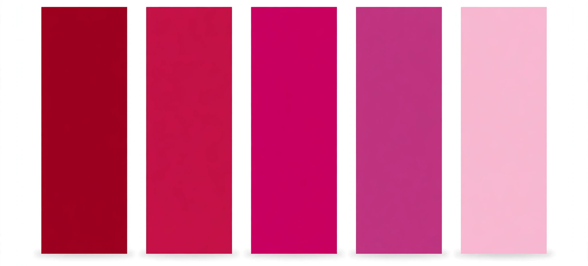
These palettes are for inspiration — not every combination has enough contrast for text. Check any pair you plan to use for text with the WCAG Color Contrast Checker. Complementary pairs colors opposite on the wheel; analogous uses neighbours; triadic uses three evenly spaced colors; monochromatic varies lightness; split-complementary pairs a color with the two neighbours of its opposite.
What is the Color Palette Generator?
A color palette generator is a tool that builds a set of colours that work together, starting from one colour you choose. Pick a starting colour and a palette type, and this free color palette generator gives you five matching swatches, each with its HEX, RGB and HSL values, ready to copy — plus the whole palette as CSS variables you can paste into your stylesheet.
Choosing colours that go together is one of the hardest parts of designing a website. A single colour is easy; five that harmonise is not. The usual advice is to learn colour theory — complementary, analogous, triadic and the rest — and then do the arithmetic on the colour wheel yourself. This tool does the theory for you: it takes your starting colour, applies the harmony rule you choose, and shows you the result as five swatches you can see and copy.
It is for anyone building a website — beginners who need a colour scheme for their first site, designers looking for a fresh combination, and developers who need a palette for a new project. It runs entirely in your browser. There is no sign-up, nothing is uploaded, and the colours you pick never leave your device.
How to use the Color Palette Generator
The tool sits at the top of this page. The controls are on the left and the palette swatches are on the right. Follow these steps:
- Pick a starting colour. Click the colour swatch under “Starting color” and choose any shade, or type a HEX code into the “HEX” field. The tool loads with the site’s crimson,
#E62F41, so you can see a palette straight away. - Choose the palette type. The “Palette type” dropdown offers five harmonies: Complementary, Analogous, Triadic, Monochromatic and Split-complementary. Each one is a different rule for picking colours from the wheel, and each gives a different mood — the section below explains them.
- Look at the five swatches. Each swatch shows its colour with its HEX, RGB and HSL values, and the text on each swatch is black or white — whichever reads better on that colour. Click a swatch’s Copy button to copy that single colour.
- Try Regenerate. Click “Regenerate” to shift the starting hue and get a new variation of the same harmony. It is the fastest way to explore: keep the palette type, keep clicking, and stop when a combination catches your eye.
- Try a random palette. Click “Random palette” to pick a completely new starting colour and generate from there. It is a good cure for a blank page.
- Copy the whole palette as CSS variables. Click “Copy as CSS variables” and you get the five colours as a
:rootblock, ready to paste into your stylesheet. “Reset” restores the default crimson starting colour.
Worked example: a complementary palette from crimson
Say your brand colour is crimson #E62F41 and you need a small palette for a landing page. Leave the starting colour as it is and choose “Complementary”. The tool shows five swatches built around crimson and its opposite on the colour wheel. Click “Copy as CSS variables” and you get something like this:
:root {
  --palette-1: #E62F41;
  --palette-2: #41E6D8;
  --palette-3: #F2A0A8;
  --palette-4: #8A1A26;
  --palette-5: #1A8A80;
}
Paste that block at the top of your stylesheet, then use the variables wherever you need a colour:
.button {
  background: var(--palette-1);
  color: #ffffff;
}

.card {
  background: #ffffff;
  border: 1px solid var(--palette-3);
}
The exact shades depend on the starting colour, but the shape is always the same: five variables, --palette-1 to --palette-5, in the order the swatches appear. If you change your mind about the starting colour later, regenerate the palette and paste the new block over the old one.
The five palette types
Complementary. Pairs colours opposite each other on the colour wheel — crimson with teal, blue with orange. The contrast is strong and energetic, which makes complementary palettes good for calls to action and highlights. Use one colour as the main colour and the other sparingly, or the page can feel like it is shouting.
Analogous. Uses neighbouring colours on the wheel — crimson, magenta and orange, for example. The result is calm and harmonious because the colours are close together. Analogous palettes are good for backgrounds and large areas, where you want colour without contrast fighting for attention.
Triadic. Uses three colours evenly spaced around the wheel, 120 degrees apart. Triadic palettes are balanced and lively — more varied than analogous, less jarring than complementary. They work well when a design needs three distinct accents, such as a dashboard with three categories.
Monochromatic. Uses one hue and varies only its lightness — the same crimson from nearly white to nearly black. Monochromatic palettes are the safest choice: nothing can clash, because there is only one colour. They look clean and professional, and they are a good starting point if you are unsure about colour.
Split-complementary. Pairs a colour with the two neighbours of its opposite — crimson with blue-green and green, rather than with a single teal. It keeps the energy of a complementary pair but softens it, because the two opposite colours are close to each other. It is a good compromise when a straight complementary pair feels too harsh.
Tips for better palettes
Start from a colour you already have. A brand colour, a logo, a photo — any real starting point is better than a random one. Type its HEX code into the “HEX” field and generate from there. A palette built on a colour that already exists in your project will always fit better than one built from nothing.
Use one colour for most of the page. A palette has five colours, but a page should not use all five equally. Pick one as the main colour, one as the accent, and keep the rest for small details — borders, hover states, a highlight.
Check contrast before using a pair for text. These palettes are made for inspiration, and not every combination has enough contrast for text. A pale swatch with white text, or two mid-tone swatches together, can be unreadable. Check any pair you plan to use for text with the WCAG Color Contrast Checker on this site — it will tell you the contrast ratio and whether it passes the accessibility standard.
Regenerate before you settle. The first palette is rarely the best one. Click “Regenerate” a few times and compare the variations: the same harmony with a slightly shifted hue can feel completely different. Save the HEX codes of any palette you like — copy them as CSS variables — before you generate the next one, or you will lose it.
Frequently asked questions
How many colours are in a palette?
Five. Each palette has five swatches, and each one shows its HEX, RGB and HSL values with a Copy button. Five is enough for a small design system — a main colour, an accent, a light background, a dark text colour and one extra — without being so many that choosing becomes hard.
What is the difference between complementary and split-complementary?
Complementary pairs a colour with the single colour directly opposite it on the wheel. Split-complementary pairs it with the two colours either side of that opposite. The split version is softer: the two opposite colours are close together, so the contrast is strong but not as stark as a single direct opposite.
Can I use these palettes for text?
You can, but check the contrast first. The palettes are built for colour harmony, not for readability, and some combinations do not have enough contrast for text. Run any foreground and background pair through the WCAG Color Contrast Checker on this site before you use it for body text or buttons.
How do the CSS variables work?
Clicking “Copy as CSS variables” gives you a :root block with five variables, --palette-1 to --palette-5, set to the five swatch colours. Paste it into your stylesheet, then use var(--palette-1) wherever you need the first colour. If you regenerate the palette, the variable names stay the same and only the values change, so your stylesheet keeps working.
Is my palette saved anywhere?
No. The tool runs entirely in your browser. Nothing you pick is sent to a server or stored, and there is no account. If you like a palette, copy it as CSS variables or write down the HEX codes before you leave the page.
Conclusion
A good palette is a decision made once and reused everywhere: five colours, five variables, and a site that feels like it was designed on purpose rather than assembled by accident. Build yours above with the Color Palette Generator, starting from a colour you already have. If you need a single shade in a particular format, the HTML Color Picker on this site will give you any colour as HEX, RGB or HSL — and it will convert between them for you.