
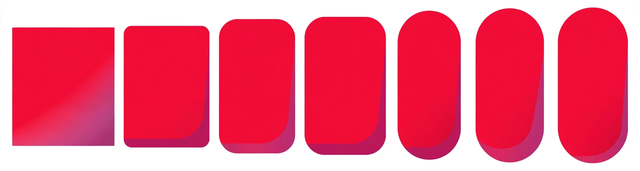
Corners are listed clockwise from the top left: top left, top right, bottom right, bottom left. A radius cannot be negative — it is set to 0 if you enter one. Percentages are relative to the box; if two adjacent corners add up to more than 100%, the browser scales them down to fit.
What is the CSS Border Radius Generator?
A CSS border radius generator is a visual tool that rounds the corners of a box for you and writes the CSS. You drag sliders for each corner, watch the shape change in the live preview, and copy the finished border-radius value. It takes a property that is easy to get wrong by hand — four corners, two axes each — and turns it into something you can see.
Rounded corners are everywhere in modern design: buttons, cards, profile pictures, input fields and badges. A small radius of 4 or 8 pixels softens a box just enough to feel friendly; a 50% radius turns a square into a circle or a pill. Getting there by typing numbers and refreshing is slow, and the interesting shapes — a different radius on each corner, or an elliptical curve — are hard to picture from numbers alone. This free CSS border radius generator shows you the shape as you build it.
The tool is for anyone building a website, from beginners learning CSS to developers who need a pill button or a blob shape without the guesswork. It runs entirely in your browser. There is no sign-up, nothing is uploaded, and nothing you set leaves your device.
How to use the CSS Border Radius Generator
The tool sits at the top of this page. The controls are on the left and the live preview with the generated CSS is on the right. Follow these steps:
- Pick a starting point. Click one of the presets: Square, Slightly rounded, Rounded, Large, Pill or Blob. The tool loads with the Rounded preset — 8 pixels on every corner — so you can see a gently rounded box straight away.
- Choose how to control the corners. The “Corners” dropdown offers “All corners together” or “Individual corners”. Together is faster when every corner should match; individual lets you set each corner on its own — for example, rounded on the top and square on the bottom.
- Pick the unit. The “Unit” dropdown offers Pixels (px) or Percent (%). Pixels give you an exact size; percentages are relative to the box, so 50% on every corner makes a circle or a pill whatever the box size is. The unit applies to every corner.
- Try elliptical. Tick “Elliptical (different horizontal and vertical radius)” and each corner gets two values instead of one — a horizontal radius and a vertical radius. This is how you make oval corners and organic blob shapes that a single radius cannot produce.
- Drag the corner sliders. Each corner has a slider kept in sync with a number box, so you can drag for a feel or type an exact value. Corners are listed clockwise from the top left: top left, top right, bottom right, bottom left. A radius cannot be negative — if you enter one, it is set to 0.
- Copy the CSS. Click “Copy CSS” to copy it to the clipboard, or “Download CSS” to save it as a file. “Clear” empties the output and “Reset” restores the Rounded preset.
Worked example: a pill button
Say you want a pill-shaped button — fully rounded ends, the classic shape for calls to action. Click the Pill preset. The preview shows a pill, and the Generated CSS box reads:
border-radius: 50%;
That single value rounds every corner by half the box’s height, which is what makes the ends fully round. Paste it into your button class:
.button {
  background: #e62f41;
  color: #ffffff;
  padding: 12px 24px;
  border: none;
  border-radius: 50%;
}
The pill shape works at any width because the radius is a percentage, not a fixed number of pixels. If the button grows, the ends stay round. The same 50% on a square box makes a circle — the trick behind round profile pictures.
Where to use border radius
Buttons. A small radius makes a button feel clickable and modern. 4 pixels is barely noticeable, 8 pixels is the common default, and a full pill is the friendliest option for a primary call to action. Use the same radius on every button on your site so they feel like one family. A button with square corners next to a button with a pill shape looks like a mistake.
Cards and images. Cards look better with the same radius as their contents. If a card has an 8-pixel radius and the photo inside it is square, the photo’s sharp corners will poke out past the card’s curve. Give the image the same radius — or a slightly smaller one — so the edges line up. The same applies to a video or a map embedded in a card.
Avatars and badges. A 50% radius turns a square image into a circle, which is the standard shape for profile pictures. For badges and tags, a pill shape reads better than a rectangle because the rounded ends soften the label.
Tips for better corners
Match the radius to the element’s size. A 4-pixel radius on a 400-pixel card is almost invisible; the same 4 pixels on a 32-pixel button is obvious. Small elements need small radii, large elements need larger ones.
Use percentages for circles and pills, pixels for everything else. Percentages scale with the box, so a circle stays a circle if the image size changes. Pixels stay fixed, which is what you want for cards and buttons where the radius should not grow with the element. Mixing the two on one site is fine — just use each where it fits.
Try the Blob preset for organic shapes. The Blob preset sets individual elliptical corners — 60% 40% 55% 45% on the horizontal axis and 40% 60% 45% 55% on the vertical — which makes an uneven, organic shape instead of a neat rectangle. It works well for decorative shapes and blob backgrounds behind a heading. The generated CSS looks unusual, but it is a single standard property:
border-radius: 60% 40% 55% 45% / 40% 60% 45% 55%;
The values before the slash are the horizontal radii, the values after it are the vertical radii, and both lists run clockwise from the top left.
Keep one radius per component. A site where cards are 8 pixels, buttons are 16 pixels and inputs are 4 pixels looks scattered. Pick two or three radii — one small, one medium, one pill — and use them consistently.
Remember the 100% rule. Percentages are relative to the box, and if two adjacent corners add up to more than 100%, the browser scales them down to fit.
Frequently asked questions
What does border-radius actually do?
It rounds the corners of an element’s box. border-radius: 8px; curves all four corners by 8 pixels. You can also set each corner separately — border-radius: 8px 16px 8px 16px; — with the values running clockwise from the top left. The property also rounds the element’s border and background, so a coloured box keeps its colour right up to the curve.
What is an elliptical radius?
A normal radius is a quarter-circle: the same distance horizontally and vertically. An elliptical radius uses two different distances, so the corner is an oval curve instead of a circle. You write it with a slash: border-radius: 60% 40% / 40% 60%; means the horizontal radii are 60% and 40% and the vertical radii are 40% and 60%. Elliptical corners are how you make blob shapes.
How do I make a perfect circle?
Make the element square — the same width and height — and set the radius to 50%. border-radius: 50%; on a 100 by 100 pixel box gives a circle. On a rectangle, 50% gives a pill (fully rounded ends) or an oval, depending on the proportions. This is the standard technique for round avatars.
Why do my corners look different from the numbers I set?
Two reasons are common. First, percentages are relative to the box, so the same percentage looks different on boxes of different sizes. Second, if adjacent corners add up to more than 100%, the browser scales them down to fit — so very large values get reduced silently. Check the preview: if the shape looks right there, the numbers are doing what the browser will do.
Does border-radius work in all browsers?
Yes. It is supported by every modern browser with no prefix needed. Very old browsers ignore it and show square corners, which is a safe failure — the content is still fully usable, just less rounded.
Conclusion
Rounded corners are a small detail with a large effect on how a page feels: a few pixels is the difference between a stern rectangle and a friendly button. Build your shape above with the CSS Border Radius Generator, starting from a preset and adjusting the corners until it looks right. If you want the box to lift off the page as well, the CSS Box Shadow Generator on this site will add the matching shadow.