
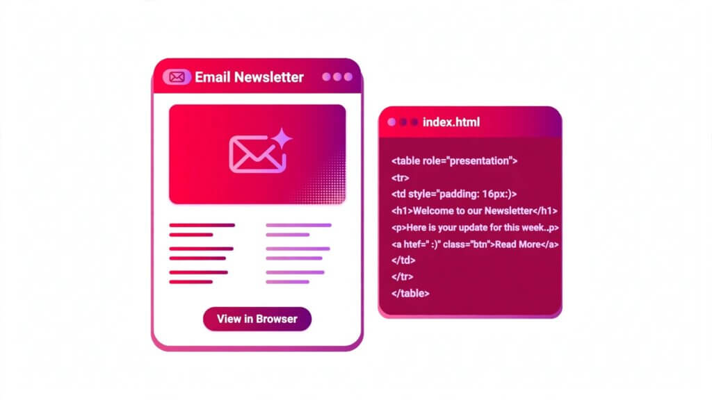
HTML Email: Tables, Inline CSS & Templates That Work
HTML email is the part of web development where everything you know about modern HTML stops working. You write a clean layout with flexbox, test it in Chrome, send it — and in Outlook it falls apart, in Gmail half the styling vanishes, and on a phone the columns stack into a mess. Email HTML is frozen somewhere around 2005, and it will stay there: the inbox is not a browser, and the rules that make a web page work are not the rules that make an email render.
This guide covers HTML email the way it actually works in 2026: why tables are still the only reliable layout, why every style must be inline, the 600-pixel rule, bulletproof buttons that survive Outlook, what Gmail strips and what it clips, how the new Outlook changes the picture, dark mode, accessibility, and testing. Every example is a complete, runnable HTML document you can copy, send to yourself, and watch survive the inbox.
Quick Takeaways
- HTML email is not web HTML. Email clients render with different engines, strip styles, and ignore most modern CSS — so you build with tables, inline CSS, and fixed widths.
- Layout goes in nested
<table>elements withrole="presentation",cellpadding="0",cellspacing="0", andborder="0". Never use flexbox, grid, or floats for email layout. - All critical CSS must be inline (
style="..."). Use a<style>block only for progressive enhancements such as media queries and dark mode. - Keep the container at 600 pixels maximum, with
width="100%"andmax-width: 600pxso it scales down on phones. - Outlook on Windows (the classic desktop client) renders email through Microsoft Word’s engine — no border-radius, no box-shadow, no background images, no max-width. Use
<!--[if mso]>conditional comments, ghost tables, and VML for Outlook-only code. - Gmail strips external stylesheets and most
<style>content in some contexts, and it clips any message whose HTML passes about 102 KB — keep your HTML well under 90 KB so the footer and unsubscribe link survive. - Always include a plain-text version, real alt text on every image, and width and height attributes on every image. Roughly two in five recipients read email with images blocked.
- Test every template in real clients (Litmus or Email on Acid) before you send it. A browser preview proves nothing about the inbox.
1. Why HTML Email Is Not Web HTML
A web page is rendered by one of a handful of modern browser engines, all of which support the same HTML and CSS standards. An email is rendered by dozens of different engines, some of them decades old, and none of them agree with each other. Gmail on the web, Gmail on Android, Apple Mail on iPhone, Outlook on Windows, Outlook on the web, Yahoo Mail — each one parses your HTML differently, strips different things, and supports a different subset of CSS.
The worst offender has always been Outlook on Windows. Outlook 2007 through the classic 2016–2024 desktop client renders email through Microsoft Word’s layout engine — a word processor, not a browser. Word’s engine has no meaningful support for flexbox, CSS grid, max-width, min-width, positioning, floats, or animations. It ignores border-radius and box-shadow, drops CSS background images on most elements, and handles padding on <div> elements unreliably. That is why the entire email industry still builds layouts out of tables: a table is the one structure Word renders predictably.
The picture is changing, but slowly. The new Outlook for Windows, built on a Chromium-based engine, became the default experience in enterprise environments in January 2026, and Microsoft plans to end support for Word-based rendering in October 2026 — although the classic Outlook client will remain supported until at least 2029. Until the last Word-rendering Outlook disappears from offices, your templates still have to survive it. Build for the worst client first, then layer enhancements on top for the good ones.
Gmail is the second problem. It is the most common email client and one of the most aggressive at stripping CSS: it removes external stylesheets, @import rules, most @font-face declarations, positioning properties, CSS grid, transforms, animations, transitions, box-shadow, and filter. It also strips <style> blocks in some contexts — forwarded messages and clipped messages lose them. And it clips any message whose HTML exceeds about 102 KB, hiding everything after the cut behind a “View entire message” link, including your footer, your unsubscribe link, and your open-tracking pixel.
Apple Mail is the most forgiving major client. It uses WebKit, so it supports modern CSS, media queries, and even web fonts. But it inverts your colours in dark mode whether you asked it to or not, which breaks carefully chosen palettes. Outlook for Mac and Outlook on the web also use WebKit-based engines and behave much closer to Apple Mail than to classic Outlook on Windows.
The practical consequence is simple: an HTML email template is not a web page with a few compromises. It is a different medium with its own rules, and the rules have barely changed in fifteen years. Learn them once and every template you build afterwards is a variation on the same pattern.
2. The Rules That Actually Matter
Every working HTML email template follows the same small set of rules. They look old-fashioned because they are old-fashioned — but they are the difference between an email that renders and one that arrives as a broken pile of unstyled text.
Tables for layout, not divs. All structure goes in nested <table> elements. Add role="presentation" to every layout table so screen readers skip it, and set cellpadding="0", cellspacing="0", and border="0" so no gaps or borders appear. Build columns by nesting tables inside table cells, never by floating divs.
Inline CSS for everything structural. Put styles in style="..." attributes on the elements themselves. Many clients drop the <head> entirely, so a <style> block is only safe for progressive enhancements — media queries, dark-mode rules — that the email still works without.
600 pixels maximum width. The standard email container is 600 pixels wide. Wider than that and the email breaks Outlook’s reading pane and forces horizontal scrolling on small screens. Use width="100%" with max-width: 600px on the container table so it fills a phone screen and stops at 600 pixels on a desktop.
Images with width, height, and alt text. Outlook ignores CSS-based image sizing, so HTML width and height attributes are non-negotiable. Every image needs descriptive alt text, because a large share of recipients read email with images blocked — and styled alt text on an <img> tag can preserve your layout even when the image never loads.
No JavaScript, ever. JavaScript is stripped everywhere, and its presence looks suspicious to spam filters. Email is a static medium: no scripts, no interactivity beyond links and (in Apple Mail only) a few exotic features you should not rely on.
Web-safe fonts with fallbacks. Custom fonts fail in Outlook and Gmail. Use a stack such as Arial, Helvetica, sans-serif or Georgia, serif, and accept that the email will look slightly different in every client.
A plain-text part, always. Send every HTML email as a multipart message with a plain-text version alongside it. HTML-only messages score worse with spam filters, and some recipients — and some accessibility tools — read the plain-text version by choice.
Keep the HTML small. Gmail clips messages over about 102 KB of HTML. Aim for well under 90 KB so tracking code and link rewrites added at send time do not push you over the line.
| Rule | Why it exists | What breaks if you skip it |
|---|---|---|
| Tables for layout | Outlook’s Word engine ignores modern CSS layout | Columns collapse in Outlook on Windows |
| Inline CSS | Gmail and others strip <style> blocks | Email arrives unstyled |
| 600px max width | Outlook reading pane and small screens | Horizontal scrolling, broken columns |
| Image width and height attributes | Outlook ignores CSS image sizing | Images render at full size or collapse |
| Alt text on every image | Many clients block images by default | Blank boxes where content should be |
| No JavaScript | Stripped by every client, flagged by filters | Code removed; possible spam-folder delivery |
| Plain-text part | Spam filters and accessibility | Worse deliverability, unreadable for some |
| HTML under 90 KB | Gmail clips at about 102 KB | Footer and unsubscribe link hidden |
3. The Boilerplate: A Complete Starter Document
Every HTML email starts from the same boilerplate. It looks strange if you are used to writing web pages — the XHTML-style namespaces, the Outlook conditional comments, the mso- properties — but each piece exists to fix a specific client bug. Copy this document, save it, and build every template from it.
<!DOCTYPE html>
<html lang="en" xmlns="http://www.w3.org/1999/xhtml" xmlns:v="urn:schemas-microsoft-com:vml" xmlns:o="urn:schemas-microsoft-com:office:office">
<head>
  <meta charset="utf-8">
  <meta name="viewport" content="width=device-width, initial-scale=1">
  <meta http-equiv="X-UA-Compatible" content="IE=edge">
  <meta name="x-apple-disable-message-reformatting">
  <meta name="color-scheme" content="light dark">
  <meta name="supported-color-schemes" content="light dark">
  <title>Your Email Subject Here</title>
  <!--[if mso]>
  <noscript>
    <xml>
      <o:OfficeDocumentSettings>
        <o:PixelsPerInch>96</o:PixelsPerInch>
      </o:OfficeDocumentSettings>
    </xml>
  </noscript>
  <![endif]-->
  <style>
    html, body { margin: 0 auto !important; padding: 0 !important; height: 100% !important; width: 100% !important; }
    * { -ms-text-size-adjust: 100%; -webkit-text-size-adjust: 100%; }
    table, td { mso-table-lspace: 0pt !important; mso-table-rspace: 0pt !important; border-collapse: collapse !important; }
    img { -ms-interpolation-mode: bicubic; border: 0; height: auto; line-height: 100%; outline: none; text-decoration: none; }
    a { text-decoration: none; }
    @media only screen and (max-width: 600px) {
      .email-container { width: 100% !important; }
      .stack { display: block !important; width: 100% !important; max-width: 100% !important; }
    }
  </style>
</head>
<body style="margin: 0; padding: 0; word-spacing: normal; background-color: #f4f4f4;">
  <div style="display: none; max-height: 0; overflow: hidden; mso-hide: all;" aria-hidden="true">
    Your preheader text goes here. It shows in the inbox preview line.
  </div>
  <center role="article" aria-roledescription="email" lang="en" style="width: 100%; background-color: #f4f4f4;">
    <table role="presentation" cellpadding="0" cellspacing="0" border="0" width="100%" style="background-color: #f4f4f4;">
      <tr>
        <td align="center">
          <!--[if mso]>
          <table role="presentation" cellpadding="0" cellspacing="0" border="0" width="600" align="center">
          <tr><td>
          <![endif]-->
          <table role="presentation" cellpadding="0" cellspacing="0" border="0" width="100%" class="email-container" style="max-width: 600px; background-color: #ffffff;">
            <tr>
              <td style="padding: 24px; font-family: Arial, Helvetica, sans-serif; font-size: 16px; line-height: 24px; color: #333333;">
                <h1 style="margin: 0 0 16px 0; font-size: 24px; line-height: 32px;">Hello, reader</h1>
                <p style="margin: 0 0 16px 0;">Your email content starts here.</p>
              </td>
            </tr>
          </table>
          <!--[if mso]>
          </td></tr>
          </table>
          <![endif]-->
        </td>
      </tr>
    </table>
  </center>
</body>
</html>
What each part does:
- The
xmlns:vandxmlns:onamespaces let Outlook understand VML (used later for background images and bulletproof buttons). Without them, VML code is ignored. <meta name="x-apple-disable-message-reformatting">stops Apple Mail from reformatting your email on iOS, which otherwise scales text unpredictably.- The
color-schememeta tags declare that the email supports light and dark mode, which stops some clients from force-inverting your colours. <o:PixelsPerInch>96</o:PixelsPerInch>fixes Outlook’s DPI scaling bug, where images and text render larger than intended on high-DPI Windows displays.- The hidden
<div>at the top of the body is the preheader — the short preview line shown next to the subject in the inbox list. It is hidden from the email itself withdisplay: noneandmso-hide: all. - The
<!--[if mso]>ghost table gives Outlook a fixed 600-pixel table, because Outlook ignoresmax-width. Modern clients use the fluid table withmax-width: 600pxinstead. - The
mso-table-lspaceandmso-table-rspaceresets remove the extra spacing Outlook adds around tables.
4. Tables for Layout: The Only Structure That Survives
If you remember one thing about HTML email, remember this: layout lives in tables. Not because tables are good — on the web they are a relic — but because they are the one structure every email client renders the same way. A nested table renders identically in Gmail, Apple Mail, Yahoo, and Outlook’s Word engine. A flexbox row does not render at all in half of them.
The pattern is always the same. An outer full-width table centres the email and paints the background. Inside it, a fixed 600-pixel container table holds the content. Inside that, each section — header, hero, body, footer — is its own row, and multi-column sections are built by nesting a table inside a cell and splitting it into cells. Every layout table carries role="presentation" so screen readers do not announce it as a data table, and cellpadding="0", cellspacing="0", and border="0" so clients add no gaps or borders of their own.
Here is a complete two-column section built the email way. On a desktop it shows two columns side by side; on a phone, the media query in the boilerplate stacks them (the stack class in section 3).
<!DOCTYPE html>
<html lang="en" xmlns="http://www.w3.org/1999/xhtml">
<head>
  <meta charset="utf-8">
  <meta name="viewport" content="width=device-width, initial-scale=1">
  <title>Two-Column Email Section</title>
  <style>
    @media only screen and (max-width: 600px) {
      .stack { display: block !important; width: 100% !important; max-width: 100% !important; }
    }
  </style>
</head>
<body style="margin: 0; padding: 0; background-color: #f4f4f4;">
  <center style="width: 100%; background-color: #f4f4f4;">
    <table role="presentation" cellpadding="0" cellspacing="0" border="0" width="100%">
      <tr>
        <td align="center">
          <table role="presentation" cellpadding="0" cellspacing="0" border="0" width="100%" style="max-width: 600px; background-color: #ffffff;">
            <tr>
              <td style="padding: 24px;">
                <table role="presentation" cellpadding="0" cellspacing="0" border="0" width="100%">
                  <tr>
                    <td class="stack" width="50%" valign="top" style="padding: 0 12px 0 0; font-family: Arial, Helvetica, sans-serif; font-size: 16px; line-height: 24px; color: #333333;">
                      <h2 style="margin: 0 0 8px 0; font-size: 20px; line-height: 28px;">Left column</h2>
                      <p style="margin: 0;">Your first block of content goes here. Keep it short — email readers scan.</p>
                    </td>
                    <td class="stack" width="50%" valign="top" style="padding: 0 0 0 12px; font-family: Arial, Helvetica, sans-serif; font-size: 16px; line-height: 24px; color: #333333;">
                      <h2 style="margin: 0 0 8px 0; font-size: 20px; line-height: 28px;">Right column</h2>
                      <p style="margin: 0;">Your second block of content goes here. Two columns is the practical maximum.</p>
                    </td>
                  </tr>
                </table>
              </td>
            </tr>
          </table>
        </td>
      </tr>
    </table>
  </center>
</body>
</html>
Three details in that example matter more than they look. First, the padding sits on the <td> elements, not on the inner table — Outlook ignores padding on some elements but respects it on table cells. Second, valign="top" aligns the two columns at the top; without it, a short column centres itself against a tall one. Third, the two columns are width="50%" as HTML attributes, not CSS — Outlook respects the attribute and ignores the CSS.
Use role="presentation" on every layout table and never on a real data table. If your email contains an actual table of data — a price list, an order summary — that table should keep its table semantics so screen readers announce it correctly. The distinction matters for accessibility, and it is one of the few places where email HTML and web HTML agree.
5. Inline CSS: What Works and What Gets Stripped
In HTML email, there are two kinds of CSS: inline styles, which mostly work, and everything else, which mostly does not. The rule is blunt — if a style must apply for the email to look right, it must be inline. The <style> block in the <head> is for progressive enhancement only: media queries, dark-mode rules, and hover states that the email can live without.
The reason is Gmail. Gmail strips <style> blocks in forwarded messages and in clipped messages, and some other clients ignore the head entirely. An email that depends on a <style> block for its font sizes and colours arrives in Gmail as unstyled Times New Roman. An email with the same styles inline arrives looking the way you built it.
What you can safely use inline: font-family, font-size, line-height, color, background-color, padding, margin (with care in Outlook), border, text-align, width, height, and display. What you cannot rely on: position, float, flexbox, grid, box-shadow, text-shadow, transform, transition, animation, and filter — Gmail removes most of these, and Outlook never supported them.
A few Outlook-specific quirks are worth knowing. Outlook ignores CSS shorthand in some places, so write padding-top, padding-right, padding-bottom, and padding-left separately instead of padding: 12px 24px where it matters. Outlook caps border widths at 8 pixels — a 10-pixel border renders as 8. Outlook ignores margin on many elements, so use padding on the parent <td> instead. And Outlook ignores max-width, which is why the ghost table in the boilerplate exists.
| CSS property | Gmail | Apple Mail | Outlook (classic, Word engine) | Outlook (new, Chromium) |
|---|---|---|---|---|
color, background-color | Yes | Yes | Yes | Yes |
font-family, font-size, line-height | Yes | Yes | Yes | Yes |
padding on <td> | Yes | Yes | Yes | Yes |
margin | Partial | Yes | Limited — use padding instead | Yes |
border, border-radius | Border yes, radius yes | Yes | Border yes (max 8px), no radius | Yes |
max-width | Yes | Yes | No — use ghost tables | Yes |
background-image | Yes (inline) | Yes | No — use VML | Yes |
box-shadow, text-shadow | No | Yes | No | Yes |
position, float | No | Partial | No | Yes |
flexbox, grid | No | Yes | No | Yes |
media queries | Yes (in <style>) | Yes | No | Yes |
prefers-color-scheme | Partial | Yes | No | Yes |
You do not have to write all that inline CSS by hand. The standard workflow is to write the template with a <style> block, then run it through a CSS inliner — a tool that moves every rule into style="..." attributes automatically. MJML, the open-source email framework, does this as part of its build step, and standalone inliners such as the one in Litmus or the free Premailer-style tools do the same. Whatever tool you use, check the output: an inliner that misses a rule leaves an unstyled element in Gmail, and the only way to catch it is to look at the final HTML.
6. Images in HTML Email
Images are the most fragile part of an HTML email. They are blocked by default in many clients, stripped of CSS sizing in Outlook, and heavy enough to push a message over Gmail’s clipping limit if you embed them. Handle them with four habits.
First, always set width and height attributes on every <img> — not just CSS. Outlook ignores CSS-based image sizing, so an image without HTML attributes renders at its natural size, which is usually far too large. Set the attributes to the display size, and add style="display: block;" so no gap appears below the image (images are inline by default, and the line box adds space underneath).
Second, write real alt text. A meaningful share of recipients — roughly two in five, by most industry estimates — read email with images blocked, and they see your alt text instead of your image. Alt text is also what screen readers announce, and it is the only copy that survives when an image fails to load. Style the alt text with inline CSS on the <img> tag (font-family, font-size, color) so the fallback text looks deliberate instead of broken.
Third, host images on a server and link to them. Never embed images as base64 data URIs and never attach them: embedded images bloat the HTML towards Gmail’s 102 KB clipping limit, attachments trigger spam filters, and some clients refuse to display either. A linked image adds one short <img> tag to your HTML; the file itself never counts towards the message size.
Fourth, keep the text-to-image balance sane. An email that is one giant image with no text is unreadable with images off, invisible to spam filters that read text, and useless to anyone using a screen reader. A rough working ratio is 70% text to 30% images. If the whole message matters, it should be text — images are decoration and illustration, not the message itself.
<img src="https://example.com/images/hero.jpg" width="600" height="300" alt="A developer reviewing an HTML email template on a laptop" style="display: block; width: 100%; max-width: 600px; height: auto; border: 0; font-family: Arial, Helvetica, sans-serif; font-size: 14px; line-height: 20px; color: #666666;">That single tag carries all four habits: HTML width and height, display: block, a fluid inline style for phones, and styled alt text as a fallback. It is the most code you will write for the simplest element in the email — and it is worth every attribute.
7. Bulletproof Buttons: The One Element Everyone Gets Wrong
The most common broken element in HTML email is the button. A styled <a> tag looks like a button in Apple Mail and Gmail, then collapses to a small underlined text link in Outlook, because Outlook ignores the padding on the anchor and drops the background colour in some versions. The fix is the bulletproof button: a table cell with a background colour, padding, and a link inside it — plus a VML fallback so Outlook renders the shape.
<table role="presentation" cellpadding="0" cellspacing="0" border="0" align="center">
  <tr>
    <td align="center" bgcolor="#d90429" style="border-radius: 4px;">
      <!--[if mso]>
      <v:roundrect xmlns:v="urn:schemas-microsoft-com:vml" xmlns:w="urn:schemas-microsoft-com:office:word" href="https://example.com/guide" style="height: 48px; v-text-anchor: middle; width: 220px;" arcsize="8%" stroke="f" fillcolor="#d90429">
        <w:anchorlock/>
        <center style="color: #ffffff; font-family: Arial, Helvetica, sans-serif; font-size: 16px; font-weight: bold;">Read the Guide</center>
      </v:roundrect>
      <![endif]-->
      <!--[if !mso]><!-->
      <a href="https://example.com/guide" style="display: inline-block; padding: 14px 32px; font-family: Arial, Helvetica, sans-serif; font-size: 16px; font-weight: bold; line-height: 20px; color: #ffffff; background-color: #d90429; border-radius: 4px; text-decoration: none;">Read the Guide</a>
      <!--<![endif]-->
    </td>
  </tr>
</table>
The VML block inside <!--[if mso]> draws a real rounded rectangle in Outlook, with the link baked into the shape. Every other client ignores the conditional comment and renders the styled anchor instead. The button works with images off, because it contains no image — and that is the whole point of “bulletproof”: it renders as a button in every client, with or without images, with or without CSS background support.
Two rules for buttons. First, never build a call-to-action as an image. An image button is invisible when images are blocked, unclickable for keyboard users, and unreadable to screen readers. Second, make the tap target generous on mobile: at least 44 pixels tall, with padding that keeps neighbouring links from being tapped by accident.
8. Outlook and the Word Rendering Engine
Outlook deserves its own section, because it is the client that breaks the most templates and the one most developers test last. Classic Outlook on Windows — versions 2007 through the 2016–2024 desktop client — renders HTML email with Microsoft Word’s engine. Word is a word processor. It was never designed to render web pages, and it shows.
What the Word engine cannot do: flexbox, grid, floats, positioning, max-width and min-width, animations, border-radius, box-shadow, CSS background images, and reliable padding on <div> elements. What it does instead: it adds its own spacing around tables (fixed with mso-table-lspace and mso-table-rspace), scales images oddly on high-DPI displays (fixed with the PixelsPerInch setting in the boilerplate), and caps borders at 8 pixels.
The tools for taming it are conditional comments. Anything inside <!--[if mso]>...<![endif]--> renders only in Windows Outlook; every other client treats it as an HTML comment and skips it. That gives you three techniques:
Ghost tables fix the width problem. Outlook ignores max-width, so a fluid 600-pixel container renders full-width in Outlook. Wrap the container in an <!--[if mso]> table with a fixed width="600" and Outlook gets a hard 600-pixel column while modern clients use the responsive version. The boilerplate in section 3 already includes one.
VML fixes backgrounds and buttons. CSS background images are dropped by Outlook, so paint them with VML — Microsoft’s vector markup language — inside a conditional comment. The bulletproof button in section 7 uses the same trick. VML looks like code from 2003 because it is, but it is the only way to put a background image behind text in classic Outlook.
mso- properties fix the small things. mso-table-lspace: 0pt and mso-table-rspace: 0pt remove Word’s table spacing. mso-hide: all hides elements (such as the preheader) from Outlook. mso-line-height-rule: exactly stops Outlook from adding extra line height to text.
The new Outlook for Windows changes the story. Built on a Chromium-based engine, it became the default experience in enterprise environments in January 2026, with much better CSS support — media queries, modern layout, and background images all work. Microsoft plans to end support for Word-based rendering in October 2026, but the classic client remains supported until at least 2029, and enterprise rollouts move slowly. The safe approach for 2026 is to keep the Outlook fallbacks in place and let the new Outlook simply ignore them: conditional comments and VML are invisible to the Chromium engine, so the same template serves both.
9. Gmail: Stripping, Clipping, and the 102 KB Limit
Gmail deserves its own section too, because it is the largest inbox and the most aggressive editor of your HTML. Three Gmail behaviours shape every template decision.
Stripping. Gmail removes external stylesheets, @import rules, most @font-face declarations, positioning properties, CSS grid, transforms, animations, transitions, box-shadow, and filter. It also strips <style> blocks in forwarded messages and in clipped messages. The practical rule is the one from section 5: if it must work, it must be inline. The <style> block is for enhancements only.
Clipping. Gmail clips any message whose HTML passes about 102 KB. It shows the first part of the email, then “[Message clipped] View entire message”, and hides the rest — including, usually, the footer, the unsubscribe link, and the open-tracking pixel. Google has never published the exact number; 102 KB is what senders have measured for years. The limit counts the HTML source — every tag, inline style, comment, and whitespace character — not the images, which load from a server and do not count. Tracking code added at send time and links rewritten into longer redirect addresses also count, so a template that measures 95 KB in your editor can cross the line by send time. Aim for well under 90 KB and you will not need to worry about it.
Promotions tab and image proxying. Gmail routes most bulk mail to the Promotions tab, which is a deliverability topic, not a template topic — but the template affects it: heavy image-to-text ratios and spam-trigger words push you there faster. Gmail also proxies every image through its own servers, which means your server logs see Google’s IP addresses, not your readers’. That is normal, and it is why open tracking in Gmail is approximate rather than exact.
Keep the HTML lean as you build: strip comments before sending, avoid repeating long inline styles where a class in the <style> block plus inlining would do, and do not paste formatted text from a word processor — pasted formatting brings hundreds of lines of junk markup with it. A clean template is usually 15–40 KB. If yours is over 80 KB, something is wrong.
10. Responsive HTML Email on Mobile
More than half of all email is now read on a phone, so a template that only works at 600 pixels wide is a template that fails most of its readers. Responsive email uses two techniques together: fluid tables and media queries.
Fluid tables are the base. The container table uses width="100%" with max-width: 600px, so it fills a phone screen and stops at 600 pixels on a desktop. Images use width: 100%; max-width: 600px; height: auto; so they scale down without distorting. Padding uses fixed pixels, which stay comfortable at any width. A fluid template with no media queries at all already works on a phone — it just shows the same layout, narrower.
Media queries add the refinement. Inside a <style> block, a @media only screen and (max-width: 600px) rule turns multi-column rows into stacked single columns by setting the cells to display: block; width: 100%. It can also enlarge tap targets, shrink heading sizes, and hide decorative elements that waste space on a small screen. Gmail and Apple Mail both support media queries; classic Outlook ignores them entirely, which is fine — Outlook on Windows is a desktop client, and the desktop layout is the one it gets.
The hybrid (or “spongy”) approach combines both: fluid tables that work everywhere, media queries that improve the experience where supported, and ghost tables that keep Outlook at a fixed 600 pixels. Test on a real phone, not just a resized browser window — a browser preview cannot show you what Gmail’s app does to your media queries, and it cannot show you the Outlook app’s rendering either.
One more mobile trap: Outlook’s mobile app truncates emails taller than about 5,000 pixels in some cases. Long newsletters with many sections can hit that limit. Keep emails focused — one message, one call to action — and the height takes care of itself.
11. Dark Mode: Stop Your Email Inverting
Dark mode is the newest rendering problem in HTML email, and the most confusing, because every client handles it differently. Apple Mail inverts your colours whether you asked it to or not. Gmail applies its own dark theme and recolors backgrounds. Outlook on the web and the new Outlook apply partial inversions. The result is white text on a white background, logos that vanish, and buttons that turn unreadable — all in the name of a feature your reader switched on deliberately.
The first line of defence is the meta tags from the boilerplate:
<meta name="color-scheme" content="light dark">
<meta name="supported-color-schemes" content="light dark">
These tell the client that your email knows about dark mode, which stops some clients from force-inverting your colours. They do not stop Apple Mail, which inverts anyway unless you give it explicit dark-mode rules.
The second line of defence is a prefers-color-scheme media query in your <style> block, which Apple Mail and modern clients respect:
<style>
  @media (prefers-color-scheme: dark) {
    .dark-bg { background-color: #1a1a1a !important; }
    .dark-text { color: #f0f0f0 !important; }
  }
</style>
Apply the classes to the elements that need them — the body table background, the text cells — and test the result in Apple Mail dark mode specifically, because it is the strictest client.
The third line of defence is design, not code. Use transparent-background images (PNG) for logos so they survive any background colour. Put text on solid background colours rather than on images, so an inversion still leaves readable contrast. Avoid pure black (#000000) and pure white (#ffffff) for large areas — near-black and off-white survive inversion more gracefully. And check contrast in both modes: the WCAG minimum of 4.5:1 for normal text applies in dark mode too, and a combination that passes in light mode can fail badly once inverted.
If you cannot test dark mode everywhere, prioritise Apple Mail — it has the largest share of opens and the most aggressive inversion. A template that survives Apple Mail dark mode usually survives Gmail’s too.
12. Accessibility in HTML Email
Email accessibility is often ignored, and it should not be. Many readers use screen readers, keyboard navigation, or high-contrast settings, and an email that ignores them is an email that excludes them. The fixes are small and mostly overlap with the rules above.
Set lang="en" (or the right language) on the <html> tag so screen readers pronounce the text correctly. Use real heading structure — <h1> for the email title, <h2> for sections — instead of styling paragraphs to look like headings. Use role="presentation" on every layout table, and never on a real data table, so screen readers skip the scaffolding and announce the content.
Write alt text that describes the image’s purpose, not its filename. A hero image of a product gets alt text describing the product; a decorative divider gets an empty alt="" so the screen reader skips it. Keep the reading order logical: the order of cells in your tables is the order a screen reader announces them, so build the HTML in the order a person should read it, not the order that was convenient to lay out.
Colour contrast matters more in email than on the web, because you cannot control the reader’s display settings. Body text should meet the 4.5:1 WCAG contrast minimum against its background, and links should be distinguishable by more than colour alone — an underline, a bold weight, or both. Never put essential information in an image alone: if the image does not load, the information is gone, and no alt text can replace a paragraph.
Finally, make links and buttons keyboard-friendly. A bulletproof button built from a table and an anchor is keyboard-focusable by default; an image button is not. Use descriptive link text — “Read the complete guide” — never “click here”, which tells a screen-reader user nothing about where the link goes.
13. Testing Before You Send
A browser preview proves nothing about the inbox. The only way to know what your template looks like in Gmail, Outlook, and Apple Mail is to render it in Gmail, Outlook, and Apple Mail — and that is what testing tools exist for.
Litmus and Email on Acid are the two established services. You paste your HTML (or send a test email to a special address) and they return screenshots from dozens of real clients and devices: Gmail web and app, Outlook desktop and web, Apple Mail on Mac and iPhone, Yahoo, Samsung Mail, and more. They also flag spam-filter triggers, broken links, missing alt text, and image weight. Both are paid services; both offer trials, and both are cheaper than sending a broken campaign to a real list.
The manual alternative is a test matrix: send the email to a Gmail account, an Outlook.com account, and an Apple Mail account, and open each on desktop and on a phone. It is slower and covers fewer clients, but it catches the big problems — and it is free. Whatever method you use, test the same five things every time:
- The layout at 600 pixels and at 320 pixels — columns stack, nothing overflows, no horizontal scrolling.
- The email with images blocked — alt text shows, the message still makes sense, the button still renders.
- The email in dark mode — text stays readable, logos stay visible, nothing inverts into invisibility.
- The links — every link goes to the right place, and the unsubscribe link works.
- The size — the HTML file is well under 90 KB, so Gmail will not clip it.
Keep a checklist of these five checks next to your send button. The most expensive email mistake is not a broken layout — it is a broken layout sent to ten thousand people at once, with no recall button.
14. A Complete Newsletter Template
Here is everything in this guide assembled into one working newsletter template. It is a complete, runnable HTML email: copy it into a file, replace the placeholder text and links, send it to yourself, and open it in Gmail, Outlook, and Apple Mail. It should look right in all three — and where it does not, the sections above explain why.
<!DOCTYPE html>
<html lang="en" xmlns="http://www.w3.org/1999/xhtml" xmlns:v="urn:schemas-microsoft-com:vml" xmlns:o="urn:schemas-microsoft-com:office:office">
<head>
  <meta charset="utf-8">
  <meta name="viewport" content="width=device-width, initial-scale=1">
  <meta http-equiv="X-UA-Compatible" content="IE=edge">
  <meta name="x-apple-disable-message-reformatting">
  <meta name="color-scheme" content="light dark">
  <meta name="supported-color-schemes" content="light dark">
  <title>All About HTML — Monthly Newsletter</title>
  <!--[if mso]>
  <noscript>
    <xml>
      <o:OfficeDocumentSettings>
        <o:PixelsPerInch>96</o:PixelsPerInch>
      </o:OfficeDocumentSettings>
    </xml>
  </noscript>
  <![endif]-->
  <style>
    html, body { margin: 0 auto !important; padding: 0 !important; height: 100% !important; width: 100% !important; }
    * { -ms-text-size-adjust: 100%; -webkit-text-size-adjust: 100%; }
    table, td { mso-table-lspace: 0pt !important; mso-table-rspace: 0pt !important; border-collapse: collapse !important; }
    img { -ms-interpolation-mode: bicubic; border: 0; height: auto; line-height: 100%; outline: none; text-decoration: none; }
    @media only screen and (max-width: 600px) {
      .email-container { width: 100% !important; }
      .stack { display: block !important; width: 100% !important; max-width: 100% !important; }
      .mobile-padding { padding: 16px !important; }
    }
    @media (prefers-color-scheme: dark) {
      .dark-bg { background-color: #1a1a1a !important; }
      .dark-text { color: #f0f0f0 !important; }
    }
  </style>
</head>
<body style="margin: 0; padding: 0; word-spacing: normal; background-color: #f4f4f4;">
  <div style="display: none; max-height: 0; overflow: hidden; mso-hide: all;" aria-hidden="true">Your monthly HTML tips, guides, and news — inside.</div>
  <center role="article" aria-roledescription="email" lang="en" style="width: 100%; background-color: #f4f4f4;">
    <table role="presentation" cellpadding="0" cellspacing="0" border="0" width="100%" style="background-color: #f4f4f4;">
      <tr>
        <td align="center">
          <!--[if mso]>
          <table role="presentation" cellpadding="0" cellspacing="0" border="0" width="600" align="center">
          <tr><td>
          <![endif]-->
          <table role="presentation" cellpadding="0" cellspacing="0" border="0" width="100%" class="email-container" style="max-width: 600px; background-color: #ffffff;">
            <tr>
              <td class="mobile-padding" style="padding: 24px; font-family: Arial, Helvetica, sans-serif; font-size: 16px; line-height: 24px; color: #333333;">
                <h1 style="margin: 0 0 8px 0; font-size: 26px; line-height: 34px;">All About HTML</h1>
                <p style="margin: 0 0 24px 0; font-size: 14px; color: #666666;">Your monthly newsletter — November 2026</p>
                <h2 style="margin: 0 0 8px 0; font-size: 20px; line-height: 28px;">This month: HTML email that survives the inbox</h2>
                <p style="margin: 0 0 16px 0;">Email HTML is frozen in 2005. Tables for layout, inline CSS, and a 600-pixel container are still the rules — and this issue shows you the complete template.</p>
                <table role="presentation" cellpadding="0" cellspacing="0" border="0" align="center" style="margin: 0 auto 24px auto;">
                  <tr>
                    <td align="center" bgcolor="#d90429" style="border-radius: 4px;">
                      <!--[if mso]>
                      <v:roundrect xmlns:v="urn:schemas-microsoft-com:vml" xmlns:w="urn:schemas-microsoft-com:office:word" href="https://allabouthtml.com/html-email/" style="height: 48px; v-text-anchor: middle; width: 220px;" arcsize="8%" stroke="f" fillcolor="#d90429">
                        <w:anchorlock/>
                        <center style="color: #ffffff; font-family: Arial, Helvetica, sans-serif; font-size: 16px; font-weight: bold;">Read the Guide</center>
                      </v:roundrect>
                      <![endif]-->
                      <!--[if !mso]><!-->
                      <a href="https://allabouthtml.com/html-email/" style="display: inline-block; padding: 14px 32px; font-family: Arial, Helvetica, sans-serif; font-size: 16px; font-weight: bold; line-height: 20px; color: #ffffff; background-color: #d90429; border-radius: 4px; text-decoration: none;">Read the Guide</a>
                      <!--<![endif]-->
                    </td>
                  </tr>
                </table>
                <p style="margin: 0; font-size: 12px; line-height: 18px; color: #999999;">You are receiving this email because you subscribed at allabouthtml.com. <a href="https://example.com/unsubscribe" style="color: #999999; text-decoration: underline;">Unsubscribe</a></p>
              </td>
            </tr>
          </table>
          <!--[if mso]>
          </td></tr>
          </table>
          <![endif]-->
        </td>
      </tr>
    </table>
  </center>
</body>
</html>
This template is about 8 KB of HTML — far under Gmail’s clipping limit — and it carries every technique in this guide: the boilerplate, the ghost table, the preheader, the fluid container, the bulletproof button, and the dark-mode rules. Use it as the starting point for your own newsletters, and add sections by copying the two-column pattern from section 4.
If hand-writing all of this feels heavy, MJML is the shortcut the industry uses. MJML is an open-source framework: you write a short, readable markup language (mj-section, mj-column, mj-button), and it compiles to the full table-based, inlined, Outlook-proof HTML for you. It is the fastest way to produce a correct template without memorising every Outlook quirk — but learn the rules first, because the day MJML cannot do what you need, you will be reading its output by hand.
15. Common HTML Email Mistakes
| Mistake | What happens | Fix |
|---|---|---|
| Flexbox or grid layout | Collapses or vanishes in Outlook and Gmail | Nested tables with role="presentation" |
CSS in a <style> block only | Email arrives unstyled in Gmail | Inline all critical CSS; use an inliner |
| No width or height on images | Images render at full size in Outlook | HTML width and height attributes on every image |
| Image-only email | Blank message when images are blocked | Real text for the message; images as decoration |
| Image-based buttons | Invisible and unclickable with images off | Bulletproof table + VML buttons |
| No plain-text version | Worse spam scores; unreadable for some | Multipart message with a plain-text part |
| HTML over 90 KB | Gmail clips the footer and unsubscribe link | Strip comments and pasted formatting |
max-width without a ghost table | Full-width email in Outlook | <!--[if mso]> fixed-width table |
| No dark-mode rules | Text inverts into unreadability in Apple Mail | color-scheme meta tags + prefers-color-scheme |
| No testing | Broken layout sent to the whole list | Litmus / Email on Acid, or a manual test matrix |
Frequently Asked Questions
1. Why do I need tables for HTML email layout?
Because Outlook on Windows renders email through Microsoft Word’s engine, which has no meaningful support for modern CSS layout. Tables are the only structure that renders consistently across Gmail, Apple Mail, Yahoo, and Outlook. Flexbox and grid work in Apple Mail and the new Outlook, but they collapse or vanish in classic Outlook and in Gmail — so tables remain the standard for any email that has to work everywhere.
2. Should CSS be inline or in a style block?
Inline for anything that must work. Gmail strips <style> blocks in forwarded and clipped messages, and some clients ignore the head entirely, so structural styles — fonts, colours, padding, widths — must live in style="..." attributes. Use a <style> block only for progressive enhancements such as media queries and dark-mode rules, which the email still works without. A CSS inliner automates the conversion.
3. What is the maximum width for an HTML email template?
600 pixels. Wider templates break Outlook’s reading pane and force horizontal scrolling on phones. Build the container with width="100%" and max-width: 600px so it fills a phone screen and stops at 600 pixels on a desktop, and wrap it in an Outlook ghost table, because classic Outlook ignores max-width.
4. Why does Gmail clip my HTML email?
Gmail clips any message whose HTML exceeds about 102 KB, hiding everything after the cut behind a “View entire message” link. The limit counts the HTML source — tags, inline styles, comments, and whitespace — not linked images. Keep your HTML well under 90 KB, strip comments before sending, and do not paste formatted text from a word processor, which brings hundreds of lines of junk markup with it.
5. Do I still need to support Outlook’s Word rendering engine in 2026?
Yes, for now. The new Outlook for Windows uses a Chromium-based engine and became the default in enterprise environments in January 2026, and Microsoft plans to end Word-based rendering in October 2026 — but the classic Outlook client remains supported until at least 2029, and enterprise rollouts move slowly. Keep the ghost tables, VML, and conditional comments in place: they are invisible to modern clients, so the same template serves both.
Conclusion
HTML email rewards patience and punishes assumptions. It is the one corner of front-end development where the newest technique is the wrong answer, where a table from 2005 outperforms a flexbox row from 2025, and where the client you test last — classic Outlook on a Windows desktop in an office somewhere — is the client that breaks your template. The rules are few and they have barely changed: tables for layout, inline CSS, 600 pixels, real alt text, bulletproof buttons, a plain-text version, and a template small enough that Gmail never clips it.
Start from the boilerplate in section 3 and the newsletter template in section 14, test in real clients before every send, and treat each new client quirk as a small addition to the pattern rather than a reason to rebuild. An HTML email template built this way does not just survive the inbox — it looks deliberate in every inbox, on every device, in light mode and dark mode, with images on and images off. That is the whole job.
Next, learn how search engines read the pages your emails link to: structured data in HTML turns a plain link into a rich result. Start with the structured data guide, and keep building from there.
Related Articles You’ll Love
- Responsive Images in HTML: srcset and Picture Element Guide — images that adapt to every screen, the same problem email images solve with width attributes and fluid tables.
- HTML Meta Tags: Complete SEO List Every Page Needs 2026 — the meta tags that control how your pages appear in search and social shares, including the ones email clients read.
- HTML Accessibility Checklist: Landmarks, ARIA & Keyboard — the accessibility rules that apply to email too: semantic headings, alt text, and keyboard-friendly links.
- HTML Preload, Prefetch & Preconnect: Resource Hints Guide — how browsers fetch resources early, and why email clients ignore all of it.
- Structured Data in HTML: JSON-LD Schema Basics 2026 — machine-readable labelling for the pages your emails link to, so they earn rich results in search.