Mastering HTML Details and Summary Tags: The Complete Guide to Toggleable Content
Modern web design is all about interaction and simplicity — giving users just what they need, when they need it. One of the simplest yet most powerful ways to achieve this is by using the HTML details and summary tags. These HTML5 elements allow developers to create toggleable, expandable, and collapsible content without any JavaScript. From FAQs and documentation sections to product specs and terms & conditions — they make content dynamic, user-friendly, and SEO-rich.
In this ultimate guide, you’ll learn everything about HTML details and summary tags — what they are, how to use them, how they affect SEO and accessibility, and how to style them for better design control. Let’s dive deep into how these simple HTML elements can make your web pages more interactive and engaging.
Table of Contents
- Introduction to HTML Details and Summary Tags
- Syntax and Basic Usage
- How Details and Summary Work Together
- Styling HTML Details and Summary with CSS
- Enhancing Toggleable Content with JavaScript
- Top Use Cases for HTML Details and Summary Tags
- Accessibility and Best Practices
- SEO Benefits and Content Strategy
- Advanced Examples and Interactivity
- Performance Benefits of Native HTML Toggleable Content
- ❌ Common Mistakes to Avoid
- Browser Compatibility and Fallbacks
- Conclusion
- Frequently Asked Questions
1. Introduction to HTML Details and Summary Tags
The HTML details and summary tags were introduced in HTML5 to simplify how we create collapsible content. Before their introduction, developers relied heavily on JavaScript to show or hide sections of a webpage. Now, you can add interactive, toggleable sections using just HTML.
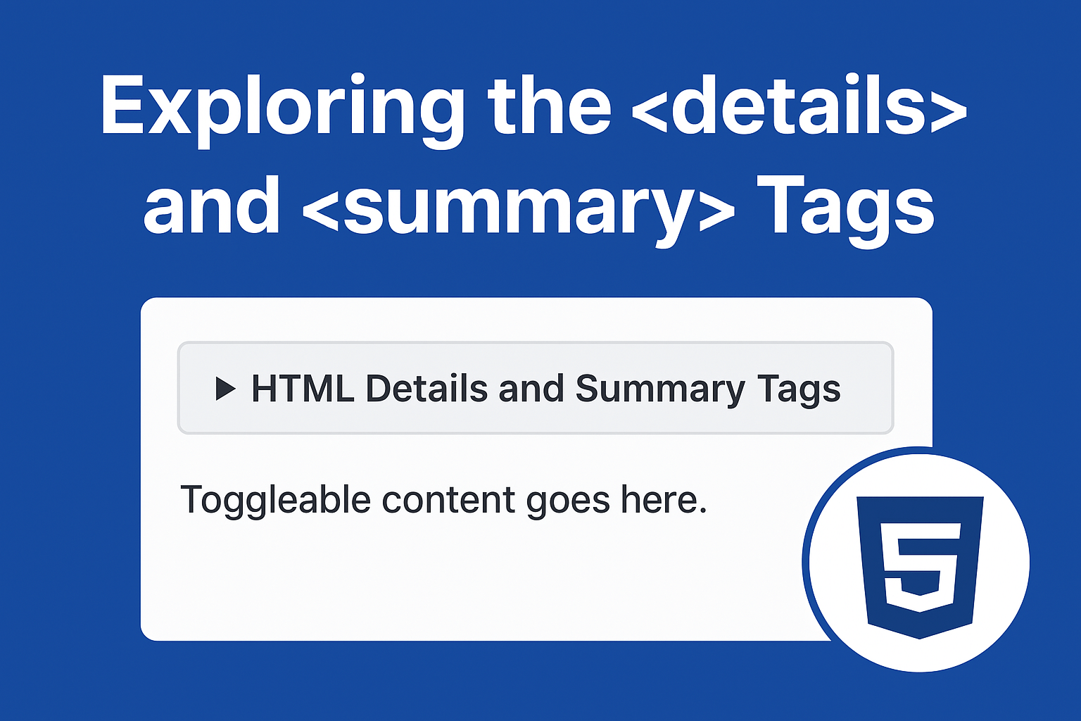
The <details> tag acts as a container that can hold hidden content, while the <summary> tag acts as the clickable header or label that expands and collapses the section.
In short, these tags allow developers to create cleaner markup, improve accessibility, and deliver better performance by avoiding unnecessary scripts.
🧠 Why You Should Use HTML Details and Summary Tags
✅ Simplicity
It’s native HTML—no scripts or external dependencies.
♿ Accessibility
Screen readers and assistive devices can interpret these elements as interactive components.
🌐 SEO-Friendly
Search engines understand semantic HTML elements better, enhancing indexing and visibility.
⚡ Performance
By using native HTML tags instead of JS, you reduce render-blocking scripts, improving page speed and Core Web Vitals.
💬 Better UX
Users can expand what they need, leading to shorter visible content and improved readability.
2. Syntax and Basic Usage
The structure is simple. Here’s how you create an expandable section using HTML details and summary tags:
<details>
  <summary>Click to reveal more information</summary>
  <p>This paragraph is hidden until the user clicks the summary.</p>
</details>
Click to reveal more information
This paragraph is hidden until the user clicks the summary.
Explanation:
<details>defines the container for toggleable content.<summary>defines the visible clickable summary.- The content inside
<details>becomes visible when the user toggles it open.
3. How Details and Summary Work Together
When the summary is clicked, the browser toggles an open attribute on the <details> element. You can also add this attribute manually if you want the section expanded by default:
<details open>
  <summary>Already expanded by default</summary>
  <p>The open attribute makes this section visible when the page loads.</p>
</details>
Already expanded by default
The open attribute makes this section visible when the page loads.
This built-in behavior saves time and ensures a smooth user experience, especially for FAQs and educational content.
4. Styling HTML Details and Summary with CSS
By default, the summary displays a small disclosure arrow and basic text formatting. But you can use CSS to make your HTML details and summary tags match your website’s design perfectly.
details summary {
  font-weight: 600;
  cursor: pointer;
  background-color: #f7f7f7;
  padding: 10px;
  border-radius: 6px;
}

details[open] summary {
  background-color: #e6f4ea;
}

details p {
  padding: 10px 15px;
  margin: 0;
  border-left: 3px solid #4caf50;
}
Already expanded by default
The open attribute makes this section visible when the page loads.
You can even add transitions and animations for a smoother expanding effect using CSS or a few lines of JavaScript (optional).
You can even create your own open/close icons:
summary::before {
  content: "▶";
  margin-right: 5px;
}

details[open] summary::before {
  content: "▼";
}
5. Enhancing Toggleable Content with JavaScript
Although these elements work fine without JS, adding a little script can enhance UX—like smooth animations or limiting open sections (accordion behavior):
<!-- Accordion Example -->
<section class="accordion-demo">
<h4>Example: Accordion Behavior with JavaScript</h4>
<details>
<summary>💡 What is HTML5?</summary>
<p>
HTML5 is the latest version of HyperText Markup Language, the standard for structuring and presenting content on the web.
It introduces new semantic elements, APIs, and multimedia support.
</p>
</details>
<details>
<summary>🎨 What are semantic tags?</summary>
<p>
Semantic tags clearly describe their meaning in a human- and machine-readable way.
Examples include <code><header></code>, <code><article></code>, and <code><footer></code>.
</p>
</details>
<details>
<summary>⚙️ What is the purpose of <details> and <summary>?</summary>
<p>
These tags allow you to create toggleable sections of content that expand and collapse when clicked —
useful for FAQs, documentation, or product information.
</p>
</details>
</section>
<script>
// Select all <details> elements
document.querySelectorAll("details").forEach((detail) => {
detail.addEventListener("toggle", () => {
// If one <details> is opened, close the others
if (detail.open) {
document.querySelectorAll("details").forEach((other) => {
if (other !== detail) other.removeAttribute("open");
});
}
});
});
</script>
<style>
.accordion-demo {
max-width: 700px;
margin: 2rem auto;
padding: 1rem;
background: #fafafa;
border-radius: 10px;
border: 1px solid #ddd;
}
details {
margin-bottom: 1rem;
border: 1px solid #ccc;
border-radius: 6px;
padding: 0.8rem;
background-color: #fff;
transition: all 0.3s ease;
}
details[open] {
background-color: #f0f9ff;
box-shadow: 0 2px 6px rgba(0, 0, 0, 0.08);
}
summary {
cursor: pointer;
font-weight: 600;
font-size: 1.1rem;
list-style: none;
}
summary::-webkit-details-marker {
display: none;
}
summary::before {
content: "▶ ";
color: #0073aa;
transition: transform 0.2s ease;
}
details[open] summary::before {
content: "▼ ";
color: #0073aa;
}
details p {
margin-top: 0.5rem;
line-height: 1.6;
}
h4 {
text-align: center;
color: #333;
margin-bottom: 1rem;
}
</style>
This makes only one section open at a time, just like a professional accordion.
OUTPUT: