
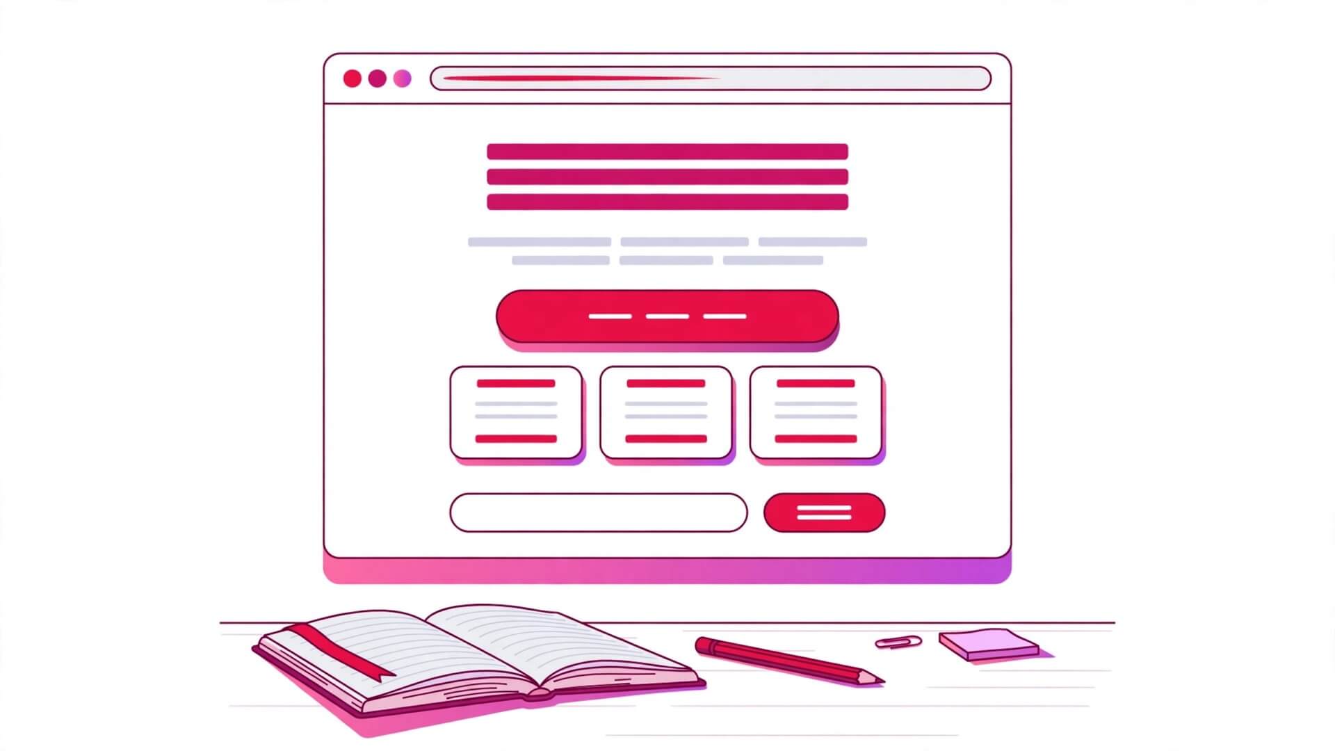
Build an HTML Landing Page From Scratch: Step-by-Step Guide
An HTML landing page is a single-purpose web page built around one action: sign up, download, buy, or book. Everything on the page exists to move a visitor toward that one action, and everything that does not help gets cut. That focus is what makes a landing page the best first project for anyone learning HTML — it uses almost every element you have learned so far, in a real order, for a real reason. By the end of this guide you will have built a complete, working landing page from a blank file: a semantic document with a header, a hero section, features, a pricing table, testimonials, a FAQ, a signup form, and a footer, styled with a small internal stylesheet and ready to validate, test on a phone, and publish.
The page we build sells a real product from this site’s own project series: the Weekly HTML Practice Kit, a set of 52 small HTML projects, one per week, with solutions and checklists. You can swap in your own product — a recipe book, a study planner, a photo preset pack — without changing the structure. The sections stay the same; only the words change. That is the point of the exercise: a landing page is a pattern, and once you have built it once, you can build it for anything.
You need nothing installed for this project. A text editor and a browser are enough. Every code block in this guide is a complete, runnable fragment, and the final section assembles all of them into one file you can save as index.html and open in your browser. Work through the steps in order, because each section builds on the one before it: the skeleton first, then the sections one at a time, then the stylesheet, then the tests.
Quick Takeaways
- An HTML landing page is a single-purpose page: one visitor, one action, and every section exists to answer the next doubt in the visitor’s mind.
- Build the page in this order: document skeleton, header and navigation, hero, trust signals, features, how it works, pricing table, testimonials, FAQ, signup form, footer, then the stylesheet.
- Use semantic landmarks throughout: one
<h1>, a<header>, a<nav>, a<main>with one<section>per idea, and a<footer>. Headings must run in order, with no level skipped. - The signup form is the conversion point of the whole page, so it gets the most care: a real
<label>for every field,type="email"withrequired, and a submit button that says what happens next. - A pricing table is a real
<table>with a<caption>and<th scope="col">headers; the FAQ is a set of<details>and<summary>elements, not a JavaScript widget. - Keep all styling in one internal
<style>block in the head while you learn: one container width, one colour palette, one breakpoint for phones, and a visible focus style on every interactive element. - Test before you publish: run the finished page through the W3C validator, open it on a phone-width screen, tab through it with a keyboard, and check every link and the form’s required-field behaviour.
What a Landing Page Is — and What This Project Builds
A landing page is not a homepage. A homepage is a front door: it introduces a whole site and offers many exits. A landing page is a corridor with one door at the end. A visitor arrives from one link — an email, a search result, a social post — reads one argument, and takes one action. If the page also tries to explain the company history, link to the blog, and show the team photos, it stops being a landing page and becomes a homepage with a signup form attached. The discipline of the format is the lesson: every section must earn its place by answering a question the visitor is actually asking.
The questions arrive in a predictable order, and the sections of the page answer them in that order. First: what is this? That is the hero section’s job, in one headline and one sentence. Then: why should I trust it? That is the trust signals — a short line of facts, numbers, or names. Then: what exactly do I get? That is the features section. Then: how does it work? That is the three-step explanation. Then: what does it cost? That is the pricing table. Then: who else uses it? That is the testimonials. Then: what if I am not sure? That is the FAQ. Then, at the moment the visitor is convinced: the signup form, asking for as little as possible. A footer with the honest small print closes the page. If a section does not answer one of those questions, it does not belong.
The product in this project is the Weekly HTML Practice Kit: 52 small HTML projects, one per week, each with a starter file, a solution, and a checklist. The free tier gives away the first four projects; the full kit costs $19 once; a classroom tier costs $49 for up to 30 seats. Those three tiers become the three columns of the pricing table, and the free tier is also the offer in the hero: “Start with 4 free projects.” Pick a product you care about if you would rather build with your own words — a printable study planner, a recipe collection, a set of photo presets — and keep the same section order. The structure is the lesson; the product is interchangeable.
One more decision before the code starts: this guide builds the page as a single HTML file with an internal stylesheet. That is a deliberate teaching choice, not a production recommendation. A real site would usually split the CSS into its own file, and a real product page would have analytics, a payment provider, and a backend for the form. None of that changes the HTML. The markup you write here is the same markup a production page uses; the styling and the plumbing sit on top of it. Learn the document first, and the rest attaches cleanly later.
The Plan: Every Section of the Page
Before writing any code, sketch the page as a list of sections. This is the outline the rest of the guide follows, and it is also a useful habit for every page you build: decide the sections before you write them, so each section has one job and the headings fall into order naturally.
| Order | Section | Element | Job — the question it answers |
|---|---|---|---|
| 1 | Header and navigation | <header> + <nav> | Where am I, and where can I go? |
| 2 | Hero | <section> with the <h1> | What is this, and what do I do next? |
| 3 | Trust signals | <section> with a short list | Why should I believe this? |
| 4 | Features | <section> with three <article> blocks | What exactly do I get? |
| 5 | How it works | <section> with an <ol> | How does it work, step by step? |
| 6 | Pricing | <section> with a <table> | What does it cost? |
| 7 | Testimonials | <section> with <blockquote> | Who else uses it? |
| 8 | FAQ | <section> with <details> | What if I am not sure? |
| 9 | Signup form | <section> with a <form> | How do I start? |
| 10 | Footer | <footer> | Who makes this, and what are the terms? |
Notice what is missing from the list: there is no sidebar, no carousel, no pop-up, and no second call to action competing with the first. The page has exactly one job, and the table above is the contract for it. When you are tempted to add something later, check it against the table: if it does not answer one of those ten questions, leave it out.
The heading outline follows the same discipline. There is exactly one <h1> — the hero headline. Every section title is an <h2>. Sub-points inside a section are <h3> elements, and nothing goes deeper than that. A screen reader user can jump through the page by headings and hear the whole argument in ten lines; a search engine reads the same outline. If you ever find yourself writing an <h3> directly under the <h1> with no <h2> between them, the structure has a hole in it — go back and give that content its own section.
Step 1: The Document Skeleton
Every page starts the same way, and this one is no exception. The skeleton is the doctype, the html element with a language, a head with the character encoding, the viewport, the title, the description, and a favicon link, and a body that holds the page. Getting the skeleton right matters more than it looks: the viewport meta tag is what makes the page usable on a phone, the description is what a search result shows, and the language attribute is what a screen reader uses to pronounce the text correctly.
<!DOCTYPE html>
<html lang="en">
<head>
  <meta charset="UTF-8">
  <meta name="viewport" content="width=device-width, initial-scale=1.0">
  <title>Weekly HTML Practice Kit — 52 Small Projects, One Per Week</title>
  <meta name="description" content="Build real HTML skills with 52 small projects, one per week. Start with 4 free projects — starter files, solutions, and checklists included.">
  <link rel="icon" type="image/png" href="favicon.png">
</head>
<body>

  <!-- Header, hero, features, pricing, FAQ, form, and footer go here -->

</body>
</html>
Three details in the skeleton deserve a pause. The viewport tag, width=device-width, initial-scale=1.0, tells a phone browser to lay the page out at the device’s real width instead of shrinking a desktop layout down to fit. Without it, every phone visitor sees a tiny, unreadable version of the desktop page, and no amount of CSS can fix that afterwards. The title is 63 characters, which is slightly over the 60-character display limit for a search result — for a landing page that matters less than for a blog post, because the page’s traffic comes from links you control rather than from search, but keep titles close to 60 characters anyway. The favicon link points at a file you should actually create: a simple 32 by 32 PNG with the product’s mark. A missing favicon is a small thing, but browsers request it on every visit, and a 404 for it is the kind of loose end that shows up in server logs forever.
The description is the page’s sales pitch in a search result, so write it the way you would write the hero subheading: what the product is, who it is for, and what the visitor gets for free. “52 small projects, one per week” is the product; “starter files, solutions, and checklists” is the contents; “start with 4 free projects” is the offer. Nothing in the description is a claim the page does not back up a few lines later.
Save this skeleton as index.html now, open it in a browser, and confirm it shows a blank page with the right title in the tab. That blank page is the foundation; every step from here adds one section to it, and you should reload and check the page after each step. A page that breaks at step 9 is easy to fix if steps 1 to 8 were checked as you went; a page assembled all at once and tested only at the end is a debugging session, not a build.
Step 2: Header and Navigation
The header is the first thing a visitor sees, and its job is small: say the product’s name, and offer the handful of links that matter. A landing page header is deliberately thin — four or five links at most, and every one of them points to a section of this same page. There is no link to a blog, a careers page, or a press kit, because every exit from the page is a visitor who does not sign up. The links that stay are the ones a sceptical visitor reaches for: what is inside, how it works, what it costs, and the questions.
<header>
  <a href="#top">Weekly HTML Practice Kit</a>
  <nav aria-label="Main navigation">
    <ul>
      <li><a href="#features">What is inside</a></li>
      <li><a href="#how-it-works">How it works</a></li>
      <li><a href="#pricing">Pricing</a></li>
      <li><a href="#faq">Questions</a></li>
      <li><a href="#signup">Start free</a></li>
    </ul>
  </nav>
</header>
The product name is a link back to the top of the page, which is the standard behaviour for a site logo or wordmark: clicking it always takes you home. The nav element carries an aria-label, which matters because a page can have more than one navigation block — a footer often has one too — and a screen reader user needs to tell them apart. Without the label, two nav elements are announced identically, and the user has no way to know which one they are in.
The links are fragment links: href="#features" jumps to the element whose id is features, on the same page. That only works if the target sections actually carry those id values, which they will — every section in this guide gets an id that matches its navigation link. Test each link as you add its section: click it and confirm the page scrolls to the right place. A fragment link pointing at a missing id does nothing at all when clicked, silently, which is the worst kind of broken link because nothing reports it.
The “Start free” link is the navigation’s call to action, and it points at the signup form at the bottom of the page. It appears again as a button in the hero and once more above the footer. Three appearances of the same offer is the right number for a page of this length: one for the visitor who arrives already convinced, one for the visitor who reads the hero and decides, and one for the visitor who reads everything and decides at the end. More than that starts to feel like pressure; fewer leaves convinced visitors hunting for the form.
Step 3: The Hero Section
The hero is the section the whole page is built around: a headline, one supporting sentence, a call to action, and a visual. It is also the only section that gets an <h1>, because the <h1> is the page’s one-line answer to “what is this?” Write the headline for a stranger who arrived mid-scroll: it must make sense with no context, it must name the benefit before the feature, and it must be short enough to read in one breath. “Build real HTML skills, one small project a week” does that; “Welcome to our website” does not, and neither does a headline that only names the product without saying what it does for the visitor.
<main id="top">
  <section aria-labelledby="hero-heading">
    <h1 id="hero-heading">Build real HTML skills, one small project a week</h1>
    <p>52 small projects with starter files, solutions, and checklists. Start with 4 free projects today — no card required, no experience needed.</p>
    <p><a href="#signup">Start with 4 free projects</a></p>
    <p>Free forever for the first 4 projects. Cancel anytime — there is nothing to cancel.</p>
    <img src="practice-kit-hero.jpg" alt="Three finished HTML project pages from the Weekly HTML Practice Kit: a tribute page, a recipe page, and a product landing page" width="1200" height="675">
  </section>
The paragraph under the headline does three jobs in two sentences. It says what is inside (starter files, solutions, checklists), it repeats the offer (4 free projects), and it removes the two objections a new visitor has before they have even formed them: “no card required” answers the fear of a surprise charge, and “no experience needed” answers the fear of not being good enough. Objection-handling belongs in the hero, not buried in the FAQ, because the visitors who need it most are the ones who never scroll far enough to find it.
The line under the button — “Free forever for the first 4 projects” — is called risk reversal, and it is worth its own line. A button that says “Start” asks for trust; a line that says what happens after the click gives the visitor a reason to give it. Keep this line honest: if the free tier expires after 14 days, say so here. A landing page that overpromises in the hero and corrects itself in the small print is a page that loses the visitor at the exact moment they were about to convert.
The image shows the finished work, not the product packaging. For a practice kit, that means screenshots of three finished project pages, because the visitor is buying the ability to make pages like those. The alt text describes what the image shows rather than repeating the headline, and the width and height attributes are present so the browser can reserve the right amount of space before the image loads — without them, the page jumps as images arrive, which is the single most annoying layout shift on a landing page. Choose a real screenshot over a stock photo every time: a visitor can tell the difference between a page you made and a photo of a stranger’s laptop, and the real one is the one that sells.
Step 4: Trust Signals
Trust signals are the shortest section on the page, and the one most builders skip. A visitor who has just read the hero is thinking “that sounds good, but is it real?” The trust section answers that question in one line of verifiable facts, placed directly under the hero where the doubt is freshest. The facts must be true, specific, and checkable: a count of learners, a count of projects, a star rating with its source, or a named publication. A vague claim — “loved by thousands” — is worse than no claim at all, because a visitor who notices the vagueness starts doubting everything else on the page too.
  <section aria-labelledby="trust-heading">
    <h2 id="trust-heading">Trusted by learners who finished something</h2>
    <ul>
      <li><strong>2,400+ learners</strong> working through the kit</li>
      <li><strong>52 projects</strong> with solutions and checklists</li>
      <li><strong>4.8 out of 5</strong> average rating from 312 reviews</li>
      <li><strong>Free to start</strong> — the first 4 projects cost nothing</li>
    </ul>
  </section>
The numbers in this example are placeholders, and that is worth saying plainly: do not ship a landing page with invented numbers. If you have 14 learners, write “14 learners” — a small true number beats a large invented one, because a true number can be defended and an invented one is a lie your visitors may discover. If you have no learners yet, use a different kind of trust signal: the number of projects, the fact that the solutions are included, or a quote from the first person who finished one. Trust is built from specifics, and the specific thing you have is always enough to start with.
The heading for this section is an <h2> like every other section heading, and it says something a human would say rather than repeating the word “trust”. “Trusted by learners who finished something” tells the visitor what the numbers are about before they read them. A heading that only says “Trust signals” or “Stats” is a label for the builder, not a message for the visitor — and on a landing page, every heading is a message for the visitor.
Step 5: Features — What Exactly Do I Get?
The features section is where the product stops being a promise and becomes a list. Each feature is one <article> with a short heading and two or three sentences: what it is, and why it matters. Three features is the right number for a page of this size; more than four and the visitor stops reading, fewer than three and the product looks thin. Order them by what the visitor cares about most, not by what was hardest to build: the starter files come first because they are what a beginner touches first, and the solutions come second because they are what makes practice safe.
  <section id="features" aria-labelledby="features-heading">
    <h2 id="features-heading">What is inside the kit</h2>
    <p>Every project follows the same pattern, so you always know where you are: a brief, a starter file, a checklist, and a worked solution to compare against.</p>

    <article>
      <h3>Starter files for every project</h3>
      <p>Each project starts from a small, working file with the boilerplate already in place and clear comments marking where your work goes. You never stare at a blank page, and you never waste a session setting up folders and doctype declarations.</p>
    </article>

    <article>
      <h3>Worked solutions to compare against</h3>
      <p>Every project ships with a finished version you can open, read, and learn from. Compare your solution with the worked one, spot the differences, and keep the technique that is clearer — not the one that is longer.</p>
    </article>

    <article>
      <h3>Checklists that catch the mistakes</h3>
      <p>Each project ends with a short checklist: validation, headings in order, alt text on images, labels on every form field. Tick them off before you move on, and the habits become automatic by the tenth project.</p>
    </article>
  </section>
Two writing rules keep this section honest. First, every feature names something the visitor can point at — a starter file, a solution, a checklist — rather than an adjective about the product. “High-quality projects” is not a feature; it is a claim with nothing behind it. “A starter file with comments marking where your work goes” is a feature, because the visitor can picture it and check it on arrival. Second, every feature ends with the benefit, not the mechanism: the starter file matters because the visitor never stares at a blank page, not because the file has a doctype in it. Features tell the visitor what they get; benefits tell them why they should care. A section with only one of the two is half a section.
The <article> element is the right wrapper for each feature, because each feature is a self-contained piece of content that would still make sense on its own — it has its own heading, its own text, and no dependency on the features around it. The aria-labelledby on the section and the matching id on the heading give the section an accessible name, which is the pattern used throughout this page: a section that has a heading should be named by that heading, so a screen reader user navigating by landmarks hears “What is inside the kit” instead of “region”.
Step 6: How It Works — Three Steps, In Order
A visitor who likes the features still has one practical question: what do I actually do on Monday morning? The how-it-works section answers it with an ordered list of three steps, each one a single sentence. Three steps is a deliberate number: two feels too thin to be a method, four starts to feel like a manual. The steps must be actions the visitor takes, not stages of your business process — “pick a project” is an action, “we send you an email” is a stage, and the visitor only cares about the first kind.
  <section id="how-it-works" aria-labelledby="how-heading">
    <h2 id="how-heading">How it works</h2>
    <ol>
      <li><strong>Pick a project.</strong> Open the list, choose the project for this week, and download its starter file. Each project takes about two hours, and the list tells you the time before you start.</li>
      <li><strong>Build it, then check it.</strong> Write the HTML, run the project checklist, and validate the page. If something breaks, the worked solution shows you the working version.</li>
      <li><strong>Keep the page.</strong> Every finished project is a page in a portfolio you can show. After 52 weeks you have 52 finished pages and the habits that made them.</li>
    </ol>
  </section>
An ordered list is the correct element here, because the steps have a sequence that matters: picking comes before building, and building comes before keeping. An unordered list would say these three things are equally important and interchangeable, which is false — a visitor who builds before picking has no project to build. HTML gives you the list type that matches the meaning, and using it is a small example of the semantic thinking this whole guide is about: the markup says what the content is, not just how it looks.
Notice that each step is a full sentence with a bold lead-in, not a fragment. “Pick a project” on its own would leave the visitor guessing what picking involves; the sentence after it — open the list, download the starter file, two hours — removes the guesswork. A how-it-works section that leaves the visitor with unanswered questions has failed at the one job it has, which is to make the first action feel easy. If a step needs more than two sentences to explain, the step is too big: split it, or simplify the product until it is not.
Step 7: Pricing — A Real Table
Pricing is the section builders are most tempted to build with styled boxes and large numbers, and the section where a real table is the honest choice. A pricing comparison is tabular data: three plans, the same set of attributes for each, and the visitor’s job is to compare down a column and across a row. A <table> does that job with structure a screen reader can navigate cell by cell, and a set of floating boxes does it with nothing but eyesight. Use the table.
  <section id="pricing" aria-labelledby="pricing-heading">
    <h2 id="pricing-heading">Pricing</h2>
    <p>One payment, yours forever. No subscription, no renewal, no surprise charge.</p>
    <table>
      <caption>Weekly HTML Practice Kit plans</caption>
      <thead>
        <tr>
          <th scope="col">What you get</th>
          <th scope="col">Starter — Free</th>
          <th scope="col">Full Kit — $19</th>
          <th scope="col">Classroom — $49</th>
        </tr>
      </thead>
      <tbody>
        <tr>
          <th scope="row">Projects included</th>
          <td>First 4 projects</td>
          <td>All 52 projects</td>
          <td>All 52 projects</td>
        </tr>
        <tr>
          <th scope="row">Starter files</th>
          <td>Yes</td>
          <td>Yes</td>
          <td>Yes</td>
        </tr>
        <tr>
          <th scope="row">Worked solutions</th>
          <td>Yes</td>
          <td>Yes</td>
          <td>Yes</td>
        </tr>
        <tr>
          <th scope="row">Checklists</th>
          <td>Yes</td>
          <td>Yes</td>
          <td>Yes</td>
        </tr>
        <tr>
          <th scope="row">New projects each year</th>
          <td>No</td>
          <td>Yes</td>
          <td>Yes</td>
        </tr>
        <tr>
          <th scope="row">Seats</th>
          <td>1</td>
          <td>1</td>
          <td>Up to 30</td>
        </tr>
        <tr>
          <th scope="row">Support</th>
          <td>Community forum</td>
          <td>Email</td>
          <td>Email, priority</td>
        </tr>
      </tbody>
    </table>
    <p><a href="#signup">Start free</a> or <a href="#signup">get the full kit for $19</a>.</p>
  </section>
Three table practices in this example are worth copying into every table you build. The <caption> names the table, so a screen reader announces “Weekly HTML Practice Kit plans” before reading a single cell — without it, the user hears a grid of numbers with no idea what they are comparing. The header cells use scope="col" for column headers and scope="row" for the row labels in the first column, which tells assistive technology which header belongs to which cell; a table without scope attributes is a puzzle the listener has to solve by counting. And the first column is a <th>, not a <td>, because “Projects included” is a label for its row, not a value in it. The distinction is small in the markup and large in the experience.
The sentence above the table — “One payment, yours forever” — is the pricing page’s risk reversal, and it belongs above the table rather than below it, because it answers the visitor’s first pricing question (“is this a subscription?”) before they start comparing numbers. The sentence below the table gives the visitor two links that both point at the signup form, and the two links differ in the words around them: one says “Start free”, the other says “get the full kit for $19”. Two links to the same form is not a mistake; it is one link per decision, and the visitor who has already decided on the paid tier should not have to scroll past the free offer to find it.
Step 8: Testimonials — Quotes With Names
Testimonials are the only section where someone other than you speaks, and that is exactly why they work: a claim you make about your own product is marketing, and the same claim from a named person who used it is evidence. Three short testimonials are enough — one from a beginner, one from a career changer, one from a teacher — and each one needs three things: a specific outcome, a full name or a handle, and a role or context. A quote with no name is decoration, and a quote with no specific outcome is noise.
  <section aria-labelledby="testimonials-heading">
    <h2 id="testimonials-heading">What learners say</h2>

    <blockquote>
      <p>"I finished the tribute page in one evening and showed it to my sister. It was the first thing I had ever built that someone else could actually use."</p>
      <p>— Aisha, learning HTML after work</p>
    </blockquote>

    <blockquote>
      <p>"The checklists are the part I did not expect to need. By the tenth project I was validating every page without thinking about it."</p>
      <p>— Marcus, career changer, now a junior developer</p>
    </blockquote>

    <blockquote>
      <p>"I run the kit as homework for my evening class. Thirty students, thirty different pages, and the solutions mean I can check them all in one sitting."</p>
      <p>— Priya, adult-education teacher</p>
    </blockquote>
  </section>
The <blockquote> element is the correct wrapper for a quotation, and the attribution line sits inside it as a plain paragraph — the dash before the name is a typographic convention, not an element, and a <cite> element belongs on the title of a work being quoted rather than on a person’s name, so it does not appear here. Each quote is short because testimonials are scanned, not studied: a visitor reads the first line of each quote and the name under it, and a paragraph that runs to five lines does not get read at all. Cut every quote to the one sentence that carries the outcome, and put that sentence first.
The same warning from the trust section applies here with more force: never invent testimonials. An invented quote with an invented name is a fabrication, and it is the fastest way to lose a visitor who checks. If you have no testimonials yet, ship the page without this section and add it when the first three learners write in — or ask the first three learners directly, and use their exact words with their permission. A page with no testimonials is a new product; a page with fake ones is a dishonest one, and visitors can tell the difference more often than builders expect.
Step 9: FAQ — Details and Summary
The FAQ answers the doubts that are too specific for the hero and too small for their own section. Five questions is the right number: the free tier’s limits, the experience needed, the time commitment, the refund, and what happens after payment. Each question is a <details> element with a <summary> for the question and a paragraph for the answer, which gives you a working accordion with no JavaScript at all — the browser handles opening and closing, keyboard users can operate it with Enter and Space, and screen readers announce the expanded state for free.
  <section id="faq" aria-labelledby="faq-heading">
    <h2 id="faq-heading">Questions</h2>

    <details>
      <summary>Do I need experience to start?</summary>
      <p>No. The first four projects assume you have never written a line of HTML. Each one introduces one idea at a time, and the starter file has comments marking exactly where your work goes.</p>
    </details>

    <details>
      <summary>How much time does a project take?</summary>
      <p>About two hours, including the checklist and the validation step. The list shows the time for each project before you start, so you can pick a short one on a busy week.</p>
    </details>

    <details>
      <summary>What do I get for free?</summary>
      <p>The first four projects, with starter files, solutions, and checklists — the same files the paid kit includes for those four weeks. There is no time limit and no card required.</p>
    </details>

    <details>
      <summary>Is there a refund?</summary>
      <p>Yes. If the full kit is not for you, write to us within 30 days of purchase and we refund the $19 in full. You keep the projects you downloaded.</p>
    </details>

    <details>
      <summary>What happens after I pay?</summary>
      <p>You get a download link for the full kit immediately, and a new project lands in your inbox every Monday for 52 weeks. Your login works forever — there is no renewal.</p>
    </details>
  </section>
Write each answer as if the visitor asked the question out loud, and answer it in the first sentence. “No. The first four projects assume you have never written a line of HTML” answers the question before the visitor has finished reading the paragraph; an answer that spends three sentences on background before reaching the point loses the reader who only wanted the yes or no. Keep the questions in the visitor’s words, too — “Do I need experience to start?” is a question a real person asks, and “What are the prerequisites for participation?” is a question nobody has ever asked out loud. If you are unsure which questions belong here, look at the emails and messages you actually receive: the FAQ is a list of the questions people ask you, not a list of the questions you wish they would ask.
One detail about <details>: the first <summary> is the only part that is always visible, so the question text inside it must make sense on its own. A summary that says “Yes” or “Click here” tells the visitor nothing until they open it, which defeats the purpose. And do not force the first item open with the open attribute unless you have a reason — five closed questions is a scannable list, and five open answers is a wall of text. Let the visitor choose which doubt to resolve.
Step 10: The Signup Form — The Conversion Point
The signup form is the point of the whole page, so it gets more care than any other section. It asks for two things only: a name and an email address. Every extra field you add — a phone number, a company, a “how did you hear about us” dropdown — costs you signups, and a landing page form that asks for a phone number is a form that has not understood its own job. The visitor is trading an email address for four free projects; the form should look like a fair trade.
  <section id="signup" aria-labelledby="signup-heading">
    <h2 id="signup-heading">Start with 4 free projects</h2>
    <p>Enter your name and email, and the first project arrives in your inbox within a minute. No card required. Unsubscribe anytime with one click.</p>
    <form action="https://example.com/signup" method="post">
      <p>
        <label for="signup-name">Your name</label>
        <input type="text" id="signup-name" name="name" autocomplete="name" required>
      </p>
      <p>
        <label for="signup-email">Email address</label>
        <input type="email" id="signup-email" name="email" autocomplete="email" required>
      </p>
      <p>
        <label for="signup-plan">Choose your plan</label>
        <select id="signup-plan" name="plan">
          <option value="free" selected>Starter — Free (first 4 projects)</option>
          <option value="full">Full Kit — $19 (all 52 projects)</option>
          <option value="classroom">Classroom — $49 (up to 30 seats)</option>
        </select>
      </p>
      <p>
        <input type="checkbox" id="signup-weekly" name="weekly" checked>
        <label for="signup-weekly">Send me one new project every Monday</label>
      </p>
      <p><button type="submit">Send me the first project</button></p>
      <p>We send one email a week, and never share your address. Read the privacy note in the footer.</p>
    </form>
  </section>
</main>
Four form practices in this example are non-negotiable. Every field has a <label> with a for attribute that matches the field’s id — clicking the label focuses the field, and a screen reader announces the label when the field is reached, which is the difference between a form a blind visitor can use and one they cannot. The email field uses type="email" rather than type="text", so a phone shows an email keyboard and the browser checks the shape of the address before the form is sent. Both fields carry required, so the browser refuses an empty submission with a message in the visitor’s own language, and the autocomplete attributes let the browser fill the fields from the visitor’s saved details. And the submit button says what happens next — “Send me the first project” — rather than the generic “Submit”, which is the least informative word in web design: it says nothing about what the visitor gets, and it is the last thing they read before deciding.
The action attribute points at https://example.com/signup because this guide has no backend to receive the form. Before you publish, replace it with your real signup endpoint — a form service, an email provider, or your own server — and test the submission end to end. A form that posts to an example address is a demo, and a demo form on a live landing page is a page that takes email addresses and drops them on the floor. Test the failure cases too: submit with an empty email, submit with an invalid email, and confirm the browser’s own error messages appear. The browser’s built-in validation is the first line of defence, and it costs nothing — but only if the required and type attributes are actually present.
The checkbox deserves a note: it is checked by default, which means the visitor is opting in to the weekly email unless they untick it. That is a common pattern, and it is only acceptable because the choice is visible, the label says exactly what the visitor is agreeing to, and the paragraph under the button says how to stop. A pre-checked box for something the visitor would not expect — sharing their address, a trial that converts to a paid plan — is a dark pattern, and it is the kind of detail that turns a good landing page into a complaint. Keep the default honest, and keep the exit obvious.
Step 11: The Footer
The footer is the small print, and its job is to be findable rather than impressive. It carries the product name, a one-line description, the links a careful visitor looks for — contact, privacy, terms — and the copyright line. Nothing here sells; everything here reassures. A footer that tries to sell is a page that does not trust its own signup form, and a footer with no contact link is a page whose owner does not want to be reached, which is a message no landing page should send.
<footer>
  <p><strong>Weekly HTML Practice Kit</strong> — 52 small projects, one per week, for people learning HTML by building.</p>
  <nav aria-label="Footer navigation">
    <ul>
      <li><a href="#top">Back to top</a></li>
      <li><a href="mailto:hello@example.com">Contact us</a></li>
      <li><a href="/privacy/">Privacy</a></li>
      <li><a href="/terms/">Terms</a></li>
    </ul>
  </nav>
  <p><small>© 2026 Weekly HTML Practice Kit. All rights reserved. Prices in US dollars. The first 4 projects are free forever; the full kit is a one-time payment of $19.</small></p>
</footer>
The footer navigation carries its own aria-label — “Footer navigation” — which is the other half of the labelling rule from step 2: two nav elements on one page must be distinguishable, and the label is what distinguishes them. The privacy and terms links point at /privacy/ and /terms/, which do not exist yet in this project; create those two pages before you publish, even as short plain pages, because a link to a missing page is a 404 at the exact moment a careful visitor is deciding whether to trust you. The copyright line repeats the pricing facts in one sentence, which is a quiet piece of honesty: a visitor who scrolls to the bottom looking for a catch finds the terms stated plainly instead.
Step 12: The Stylesheet — Making It Look Like a Real Page
So far the page is correct and ugly: a browser’s default styles, black text on white, links in blue, no spacing to speak of. That is fine while you build, because structure comes before appearance, but nobody ships a page that looks like a 1994 document. The stylesheet below is deliberately small — one internal <style> block in the head, about eighty lines — because a landing page does not need a framework, and a small stylesheet is one you can read, understand, and change. Paste it into the head of your file, replacing nothing else.
<style>
  * { box-sizing: border-box; }
  body {
    margin: 0;
    font-family: system-ui, -apple-system, "Segoe UI", Roboto, sans-serif;
    line-height: 1.6;
    color: #1f2430;
    background: #ffffff;
  }
  header, main section, footer {
    max-width: 720px;
    margin: 0 auto;
    padding: 1.5rem 1rem;
  }
  header {
    display: flex;
    flex-wrap: wrap;
    gap: 1rem;
    align-items: center;
    justify-content: space-between;
    border-bottom: 1px solid #e5e7eb;
  }
  header nav ul, footer nav ul {
    display: flex;
    flex-wrap: wrap;
    gap: 1rem;
    list-style: none;
    margin: 0;
    padding: 0;
  }
  h1 { font-size: 2.25rem; line-height: 1.2; margin: 0 0 1rem; }
  h2 { font-size: 1.5rem; line-height: 1.3; margin: 2.5rem 0 1rem; }
  h3 { font-size: 1.125rem; margin: 1.5rem 0 0.5rem; }
  a { color: #c0392b; }
  a:hover { text-decoration-thickness: 2px; }
  a:focus-visible, button:focus-visible, input:focus-visible,
  select:focus-visible, summary:focus-visible {
    outline: 3px solid #c0392b;
    outline-offset: 2px;
  }
  section[aria-labelledby="hero-heading"] p a[href="#signup"] {
    display: inline-block;
    background: #c0392b;
    color: #ffffff;
    padding: 0.75rem 1.5rem;
    border-radius: 6px;
    text-decoration: none;
    font-weight: 700;
  }
  img { max-width: 100%; height: auto; display: block; }
  table { width: 100%; border-collapse: collapse; margin: 1rem 0; }
  th, td { border: 1px solid #d1d5db; padding: 0.6rem; text-align: left; }
  thead th { background: #fdf2f2; }
  blockquote {
    margin: 1rem 0;
    padding: 0.5rem 1rem;
    border-left: 4px solid #c0392b;
  }
  details { border: 1px solid #e5e7eb; border-radius: 6px; padding: 0.75rem 1rem; margin: 0.5rem 0; }
  summary { cursor: pointer; font-weight: 700; }
  label { display: block; font-weight: 700; margin-bottom: 0.25rem; }
  input[type="text"], input[type="email"], select {
    width: 100%;
    padding: 0.6rem;
    border: 1px solid #9ca3af;
    border-radius: 6px;
    font: inherit;
  }
  button[type="submit"] {
    background: #c0392b;
    color: #ffffff;
    border: none;
    border-radius: 6px;
    padding: 0.75rem 1.5rem;
    font: inherit;
    font-weight: 700;
    cursor: pointer;
  }
  footer { border-top: 1px solid #e5e7eb; color: #4b5563; }
  @media (max-width: 640px) {
    h1 { font-size: 1.75rem; }
    header { flex-direction: column; align-items: flex-start; }
    table { font-size: 0.9rem; }
  }
</style>
A few choices in this stylesheet are worth understanding rather than copying blindly. The container rule — max-width: 720px with automatic margins — is what makes the page readable: a line of text wider than about 75 characters is hard to read, and 720 pixels holds roughly that many at a normal font size. The box-sizing: border-box rule on everything makes padding behave the way you expect: a field set to 100% width stays 100% wide including its padding, instead of overflowing its container. The focus style is the most important rule in the file: a thick crimson outline on every interactive element, shown only for keyboard focus through :focus-visible, so mouse users never see it and keyboard users always can. A page with no visible focus style is a page a keyboard user cannot navigate, and that is an accessibility failure, not a design choice.
The colour palette is deliberately restrained: near-black text, one crimson accent (#c0392b) for links, buttons, and the testimonial border, and light greys for borders and table headers. One accent colour, used consistently, looks designed; five accent colours look accidental. The single breakpoint at 640 pixels does three things: it shrinks the hero headline, stacks the header vertically, and reduces the table font so four columns fit on a phone. Test that breakpoint by resizing your browser window to phone width and scrolling the whole page — the pricing table is the part most likely to overflow, and if it does, the fix is to let it scroll horizontally inside its section rather than shrinking the text further.
Step 13: The Complete File — Everything Assembled
Here is the whole page in one file. It is exactly the sections from steps 1 to 12, assembled in order, with the stylesheet from step 12 placed in the head. Save it as index.html, open it in a browser, and you have the finished landing page. If any part of it looks different from the step where it was introduced, the assembled file below is the correct version — the steps explain the choices, and this file is the result.
<!DOCTYPE html>
<html lang="en">
<head>
  <meta charset="UTF-8">
  <meta name="viewport" content="width=device-width, initial-scale=1.0">
  <title>Weekly HTML Practice Kit — 52 Small Projects, One Per Week</title>
  <meta name="description" content="Build real HTML skills with 52 small projects, one per week. Start with 4 free projects — starter files, solutions, and checklists included.">
  <link rel="icon" type="image/png" href="favicon.png">
  <style>
    * { box-sizing: border-box; }
    body {
      margin: 0;
      font-family: system-ui, -apple-system, "Segoe UI", Roboto, sans-serif;
      line-height: 1.6;
      color: #1f2430;
      background: #ffffff;
    }
    header, main section, footer {
      max-width: 720px;
      margin: 0 auto;
      padding: 1.5rem 1rem;
    }
    header {
      display: flex;
      flex-wrap: wrap;
      gap: 1rem;
      align-items: center;
      justify-content: space-between;
      border-bottom: 1px solid #e5e7eb;
    }
    header nav ul, footer nav ul {
      display: flex;
      flex-wrap: wrap;
      gap: 1rem;
      list-style: none;
      margin: 0;
      padding: 0;
    }
    h1 { font-size: 2.25rem; line-height: 1.2; margin: 0 0 1rem; }
    h2 { font-size: 1.5rem; line-height: 1.3; margin: 2.5rem 0 1rem; }
    h3 { font-size: 1.125rem; margin: 1.5rem 0 0.5rem; }
    a { color: #c0392b; }
    a:hover { text-decoration-thickness: 2px; }
    a:focus-visible, button:focus-visible, input:focus-visible,
    select:focus-visible, summary:focus-visible {
      outline: 3px solid #c0392b;
      outline-offset: 2px;
    }
    section[aria-labelledby="hero-heading"] p a[href="#signup"] {
      display: inline-block;
      background: #c0392b;
      color: #ffffff;
      padding: 0.75rem 1.5rem;
      border-radius: 6px;
      text-decoration: none;
      font-weight: 700;
    }
    img { max-width: 100%; height: auto; display: block; }
    table { width: 100%; border-collapse: collapse; margin: 1rem 0; }
    th, td { border: 1px solid #d1d5db; padding: 0.6rem; text-align: left; }
    thead th { background: #fdf2f2; }
    blockquote {
      margin: 1rem 0;
      padding: 0.5rem 1rem;
      border-left: 4px solid #c0392b;
    }
    details { border: 1px solid #e5e7eb; border-radius: 6px; padding: 0.75rem 1rem; margin: 0.5rem 0; }
    summary { cursor: pointer; font-weight: 700; }
    label { display: block; font-weight: 700; margin-bottom: 0.25rem; }
    input[type="text"], input[type="email"], select {
      width: 100%;
      padding: 0.6rem;
      border: 1px solid #9ca3af;
      border-radius: 6px;
      font: inherit;
    }
    button[type="submit"] {
      background: #c0392b;
      color: #ffffff;
      border: none;
      border-radius: 6px;
      padding: 0.75rem 1.5rem;
      font: inherit;
      font-weight: 700;
      cursor: pointer;
    }
    footer { border-top: 1px solid #e5e7eb; color: #4b5563; }
    @media (max-width: 640px) {
      h1 { font-size: 1.75rem; }
      header { flex-direction: column; align-items: flex-start; }
      table { font-size: 0.9rem; }
    }
  </style>
</head>
<body>
  <header>
    <a href="#top">Weekly HTML Practice Kit</a>
    <nav aria-label="Main navigation">
      <ul>
        <li><a href="#features">What is inside</a></li>
        <li><a href="#how-it-works">How it works</a></li>
        <li><a href="#pricing">Pricing</a></li>
        <li><a href="#faq">Questions</a></li>
        <li><a href="#signup">Start free</a></li>
      </ul>
    </nav>
  </header>

  <main id="top">
    <section aria-labelledby="hero-heading">
      <h1 id="hero-heading">Build real HTML skills, one small project a week</h1>
      <p>52 small projects with starter files, solutions, and checklists. Start with 4 free projects today — no card required, no experience needed.</p>
      <p><a href="#signup">Start with 4 free projects</a></p>
      <p>Free forever for the first 4 projects. Cancel anytime — there is nothing to cancel.</p>
      <img src="practice-kit-hero.jpg" alt="Three finished HTML project pages from the Weekly HTML Practice Kit: a tribute page, a recipe page, and a product landing page" width="1200" height="675">
    </section>

    <section aria-labelledby="trust-heading">
      <h2 id="trust-heading">Trusted by learners who finished something</h2>
      <ul>
        <li><strong>2,400+ learners</strong> working through the kit</li>
        <li><strong>52 projects</strong> with solutions and checklists</li>
        <li><strong>4.8 out of 5</strong> average rating from 312 reviews</li>
        <li><strong>Free to start</strong> — the first 4 projects cost nothing</li>
      </ul>
    </section>

    <section id="features" aria-labelledby="features-heading">
      <h2 id="features-heading">What is inside the kit</h2>
      <p>Every project follows the same pattern, so you always know where you are: a brief, a starter file, a checklist, and a worked solution to compare against.</p>
      <article>
        <h3>Starter files for every project</h3>
        <p>Each project starts from a small, working file with the boilerplate already in place and clear comments marking where your work goes. You never stare at a blank page, and you never waste a session setting up folders and doctype declarations.</p>
      </article>
      <article>
        <h3>Worked solutions to compare against</h3>
        <p>Every project ships with a finished version you can open, read, and learn from. Compare your solution with the worked one, spot the differences, and keep the technique that is clearer — not the one that is longer.</p>
      </article>
      <article>
        <h3>Checklists that catch the mistakes</h3>
        <p>Each project ends with a short checklist: validation, headings in order, alt text on images, labels on every form field. Tick them off before you move on, and the habits become automatic by the tenth project.</p>
      </article>
    </section>

    <section id="how-it-works" aria-labelledby="how-heading">
      <h2 id="how-heading">How it works</h2>
      <ol>
        <li><strong>Pick a project.</strong> Open the list, choose the project for this week, and download its starter file. Each project takes about two hours, and the list tells you the time before you start.</li>
        <li><strong>Build it, then check it.</strong> Write the HTML, run the project checklist, and validate the page. If something breaks, the worked solution shows you the working version.</li>
        <li><strong>Keep the page.</strong> Every finished project is a page in a portfolio you can show. After 52 weeks you have 52 finished pages and the habits that made them.</li>
      </ol>
    </section>

    <section id="pricing" aria-labelledby="pricing-heading">
      <h2 id="pricing-heading">Pricing</h2>
      <p>One payment, yours forever. No subscription, no renewal, no surprise charge.</p>
      <table>
        <caption>Weekly HTML Practice Kit plans</caption>
        <thead>
          <tr>
            <th scope="col">What you get</th>
            <th scope="col">Starter — Free</th>
            <th scope="col">Full Kit — $19</th>
            <th scope="col">Classroom — $49</th>
          </tr>
        </thead>
        <tbody>
          <tr>
            <th scope="row">Projects included</th>
            <td>First 4 projects</td>
            <td>All 52 projects</td>
            <td>All 52 projects</td>
          </tr>
          <tr>
            <th scope="row">Starter files</th>
            <td>Yes</td>
            <td>Yes</td>
            <td>Yes</td>
          </tr>
          <tr>
            <th scope="row">Worked solutions</th>
            <td>Yes</td>
            <td>Yes</td>
            <td>Yes</td>
          </tr>
          <tr>
            <th scope="row">Checklists</th>
            <td>Yes</td>
            <td>Yes</td>
            <td>Yes</td>
          </tr>
          <tr>
            <th scope="row">New projects each year</th>
            <td>No</td>
            <td>Yes</td>
            <td>Yes</td>
          </tr>
          <tr>
            <th scope="row">Seats</th>
            <td>1</td>
            <td>1</td>
            <td>Up to 30</td>
          </tr>
          <tr>
            <th scope="row">Support</th>
            <td>Community forum</td>
            <td>Email</td>
            <td>Email, priority</td>
          </tr>
        </tbody>
      </table>
      <p><a href="#signup">Start free</a> or <a href="#signup">get the full kit for $19</a>.</p>
    </section>

    <section aria-labelledby="testimonials-heading">
      <h2 id="testimonials-heading">What learners say</h2>
      <blockquote>
        <p>"I finished the tribute page in one evening and showed it to my sister. It was the first thing I had ever built that someone else could actually use."</p>
        <p>— Aisha, learning HTML after work</p>
      </blockquote>
      <blockquote>
        <p>"The checklists are the part I did not expect to need. By the tenth project I was validating every page without thinking about it."</p>
        <p>— Marcus, career changer, now a junior developer</p>
      </blockquote>
      <blockquote>
        <p>"I run the kit as homework for my evening class. Thirty students, thirty different pages, and the solutions mean I can check them all in one sitting."</p>
        <p>— Priya, adult-education teacher</p>
      </blockquote>
    </section>

    <section id="faq" aria-labelledby="faq-heading">
      <h2 id="faq-heading">Questions</h2>
      <details>
        <summary>Do I need experience to start?</summary>
        <p>No. The first four projects assume you have never written a line of HTML. Each one introduces one idea at a time, and the starter file has comments marking exactly where your work goes.</p>
      </details>
      <details>
        <summary>How much time does a project take?</summary>
        <p>About two hours, including the checklist and the validation step. The list shows the time for each project before you start, so you can pick a short one on a busy week.</p>
      </details>
      <details>
        <summary>What do I get for free?</summary>
        <p>The first four projects, with starter files, solutions, and checklists — the same files the paid kit includes for those four weeks. There is no time limit and no card required.</p>
      </details>
      <details>
        <summary>Is there a refund?</summary>
        <p>Yes. If the full kit is not for you, write to us within 30 days of purchase and we refund the $19 in full. You keep the projects you downloaded.</p>
      </details>
      <details>
        <summary>What happens after I pay?</summary>
        <p>You get a download link for the full kit immediately, and a new project lands in your inbox every Monday for 52 weeks. Your login works forever — there is no renewal.</p>
      </details>
    </section>

    <section id="signup" aria-labelledby="signup-heading">
      <h2 id="signup-heading">Start with 4 free projects</h2>
      <p>Enter your name and email, and the first project arrives in your inbox within a minute. No card required. Unsubscribe anytime with one click.</p>
      <form action="https://example.com/signup" method="post">
        <p>
          <label for="signup-name">Your name</label>
          <input type="text" id="signup-name" name="name" autocomplete="name" required>
        </p>
        <p>
          <label for="signup-email">Email address</label>
          <input type="email" id="signup-email" name="email" autocomplete="email" required>
        </p>
        <p>
          <label for="signup-plan">Choose your plan</label>
          <select id="signup-plan" name="plan">
            <option value="free" selected>Starter — Free (first 4 projects)</option>
            <option value="full">Full Kit — $19 (all 52 projects)</option>
            <option value="classroom">Classroom — $49 (up to 30 seats)</option>
          </select>
        </p>
        <p>
          <input type="checkbox" id="signup-weekly" name="weekly" checked>
          <label for="signup-weekly">Send me one new project every Monday</label>
        </p>
        <p><button type="submit">Send me the first project</button></p>
        <p>We send one email a week, and never share your address. Read the privacy note in the footer.</p>
      </form>
    </section>
  </main>

  <footer>
    <p><strong>Weekly HTML Practice Kit</strong> — 52 small projects, one per week, for people learning HTML by building.</p>
    <nav aria-label="Footer navigation">
      <ul>
        <li><a href="#top">Back to top</a></li>
        <li><a href="mailto:hello@example.com">Contact us</a></li>
        <li><a href="/privacy/">Privacy</a></li>
        <li><a href="/terms/">Terms</a></li>
      </ul>
    </nav>
    <p><small>© 2026 Weekly HTML Practice Kit. All rights reserved. Prices in US dollars. The first 4 projects are free forever; the full kit is a one-time payment of $19.</small></p>
  </footer>
</body>
</html>
Before you move on, open this file and check three things. First, the hero image and the favicon will be broken links until you create those two files — the page still works, but the image shows a broken-image icon, which is the browser telling you the file is missing. Replace practice-kit-hero.jpg with a real screenshot of finished project pages, and create a small favicon.png, before you call the page finished. Second, the form posts to https://example.com/signup, which is a placeholder: replace it with your real signup endpoint and test a real submission. Third, scroll the whole page once and confirm every section is present and in the order of the plan table — header, hero, trust, features, how it works, pricing, testimonials, FAQ, signup, footer. If a section is missing, it is almost always a copy-paste slip, and it is easier to catch now than after publishing.
Step 14: Test It Before You Publish
A landing page that has never been tested is a guess, and the tests take fifteen minutes. Work through them in this order, and fix what each one finds before moving to the next — a page that passes validation but breaks on a phone is still a broken page.
1. Validate the HTML. Open the W3C validator, paste the page URL or upload the file, and read the report. Deprecated elements, unclosed tags, duplicate id values, and a label whose for attribute matches nothing are all errors the validator names precisely. Fix them in the order they appear, because one unclosed element early in the document can produce a dozen errors further down that all disappear when the first one is fixed. A clean validation is the fastest proof that the page’s structure is sound, and it is the same check this site’s validator guide walks through in detail.
2. Open it on a phone-width screen. Resize the browser window to 360 pixels wide, or open the file on a real phone, and scroll the whole page. The pricing table is the most likely problem: four columns at phone width need either smaller text or horizontal scrolling, and the stylesheet already handles the first. Check that the hero headline wraps cleanly, that the form fields are full width and easy to tap, and that nothing overflows horizontally — a page that scrolls sideways on a phone is a page visitors leave.
3. Tab through it with a keyboard. Click into the address bar, then press Tab repeatedly and watch the focus outline move: header links, hero button, navigation, form fields, the FAQ summaries, the footer links. Every interactive element must receive focus in a sensible order, and the outline must be visible on each one. Then open each FAQ item with Enter, fill in the form with the keyboard alone, and confirm the submit button is reachable and the browser’s required-field messages appear. A visitor who cannot use a mouse is a visitor like any other, and this test is the one that finds the problems they would have found.
4. Test every link and the form. Click each navigation link and confirm it scrolls to the right section — a fragment link with a typo in the id does nothing, silently. Click the “Back to top” link. Then submit the form empty and confirm the browser blocks it; submit with an invalid email and confirm the browser complains; submit with a real address and confirm it reaches your signup service. A form that has never received a real submission is a form you are guessing about, and the first real visitor should not be the test.
5. Read it out loud. Read the hero headline, the section headings in order, and the button text, as a visitor would hear them from a screen reader. The headings should tell the whole story on their own — what the product is, what is inside, how it works, what it costs, what people say, what to do next. If a heading only makes sense after reading the paragraph under it, rewrite the heading. This test takes two minutes and finds more writing problems than any other check in this list.
Common Mistakes When Building a Landing Page
Most landing pages fail in the same few ways, and all of them are avoidable. The table below is the checklist to run against your own page before you publish — if you recognise your page in the left column, the fix in the right column is the next thing to do.
| Mistake | What goes wrong | Fix |
|---|---|---|
| Two or three calls to action | The visitor has to choose between signing up, reading the blog, and following on social media, and chooses none of them | One action, repeated in the same words: the hero button, the navigation link, and the form |
| A headline that names the product, not the benefit | “Welcome to the Weekly HTML Practice Kit” tells a stranger nothing about why they should stay | Lead with the outcome: what the visitor can do after using it |
| A form that asks for too much | Every extra field costs signups; a phone-number field on a free offer can halve the conversion rate | Name and email only; ask for the rest after they have signed up |
| A pricing table built from boxes | A screen reader hears a pile of unrelated numbers with no structure, and a keyboard user cannot navigate it | A real <table> with a <caption> and scope attributes on every header |
| No visible focus style | Keyboard users cannot see where they are on the page, and the page is unusable for them | A :focus-visible outline on every interactive element, as in step 12 |
| Invented numbers and testimonials | A visitor who checks finds the lie, and the whole page loses credibility in one moment | Use true numbers, however small; ship without testimonials until you have real ones |
| A hero image that shows nothing | A stock photo of a laptop tells the visitor nothing about the product | Show the finished work: real screenshots of real project pages |
| Skipped heading levels | An <h1> followed by an <h3> breaks the document outline for screen readers and search engines | One <h1>, then <h2> for sections, <h3> for sub-points, nothing deeper |
| The form posts nowhere | The page collects email addresses and drops them, because the action still points at a placeholder | Replace the example endpoint with a real one and test a real submission |
| No mobile test | The page looks right on a laptop and breaks on the phone most visitors actually use | Resize to 360 pixels, scroll the whole page, and fix the pricing table first |
What to Build Next
A landing page is a pattern, and the fastest way to learn it is to build it twice with different products. Take the same file, change the product to something you care about — a printable study planner, a recipe collection, a set of photo presets — and rewrite only the words: the hero, the features, the pricing, the testimonials, the FAQ. The structure stays exactly as it is. The second build takes half the time of the first, and the third takes half again, because the pattern is now something you know rather than something you are following.
Then change one thing about the structure and watch what happens. Add a second image section showing the product in use, and see whether the page feels richer or just longer. Move the pricing table above the testimonials and see whether the argument still flows. Try a version with the FAQ above the pricing table, and ask a friend which order answers their doubts sooner. These are small experiments, and they are how a template becomes a skill: you stop copying the pattern and start understanding which parts of it do the work.
After that, the natural next projects are the ones this page points at. Turn the internal stylesheet into an external file and link it from two pages, so a colour change in one place updates both. Build the privacy and terms pages the footer links to, as short plain pages. Then build the thank-you page the form should send visitors to after signup — a page that says what happens next, when the first project arrives, and what to do if it does not. Each of those is a small page that uses the same skeleton, the same landmarks, and the same testing habits as this one.
Frequently Asked Questions
1. What is the difference between a landing page and a homepage?
A homepage introduces a whole site and offers many exits; a landing page has one purpose and one action. A visitor arrives at a landing page from a single link, reads one argument, and takes one action — sign up, download, or buy. A homepage that tries to do a landing page’s job has too many competing links, and a landing page that tries to do a homepage’s job stops converting. Build the page for the visitor who arrived from one link, and give that visitor one thing to do.
2. How long should a landing page be?
As long as the argument needs, and no longer. The page in this guide has ten sections, which is about right for a $19 product that needs trust, features, pricing, and a FAQ to sell. A free download might need only a hero, three features, and a form. A $500 course might need twice this length, with a curriculum section and a guarantee. The test is not the word count: it is whether every section answers a question the visitor is actually asking. Cut a section and see if anything is lost — if nothing is lost, the section was not earning its place.
3. Do I need JavaScript for a landing page?
No. Every interactive part of the page in this guide works without JavaScript: the FAQ uses <details> and <summary>, the navigation uses fragment links, the form uses the browser’s built-in validation, and the pricing table is a plain table. JavaScript becomes useful later — for analytics, for a payment widget, for a carousel you probably do not need — but a landing page that depends on JavaScript to show its own content is a page that breaks for the visitors whose JavaScript fails. Build the working page first, then add scripts only where they add something the HTML cannot do.
4. Should the CSS be in a separate file?
For a single landing page, an internal stylesheet in the head is fine, and it is what this guide uses: one file, nothing to lose track of, and the styles travel with the page. When a second page shares the same design, move the CSS into an external file and link it from both pages, so a colour change in one place updates every page at once. The rule is simple: one page, internal styles are acceptable; two or more pages, an external stylesheet pays for itself immediately. The HTML does not change either way.
5. How do I know if my landing page works?
Measure the one action it exists for. If the page’s job is signups, the number that matters is the percentage of visitors who complete the form — the conversion rate — and the only way to know it is to watch real visitors, not to guess. Before that, the checks in step 14 are the proxy: a valid page, a page that works on a phone, a page a keyboard user can complete, and a form that reaches your inbox. A page that passes all four is a page that is ready to be measured, and a page that fails any of them is a page whose conversion rate is measuring its own defects rather than its argument.
Conclusion
An HTML landing page is a complete project in a single file: a semantic document with one purpose, ten sections in a deliberate order, a form that asks for as little as possible, and a small stylesheet that makes it readable on any screen. The pattern is the same whatever the product is — a hero that names the benefit, trust signals that prove it is real, features that say what is inside, three steps that say how it works, a pricing table that says what it costs, testimonials that say who else uses it, a FAQ that answers the doubts, and a form that collects the email. Build it once, following the steps in order, and you have a page you can publish. Build it twice with a different product, and you have a skill you can use for anything.
Start now, with the file from step 13. Save it, replace the placeholder image and the placeholder form endpoint with real ones, run the five tests from step 14, and publish it. Then show it to one person and watch them use it: where they pause, where they scroll past, where they reach for the form. Their behaviour is the only review that matters, and it will tell you more about your landing page than any checklist can — including this one.
Related Articles You’ll Love
- 10 HTML Projects for Beginners That Actually Teach You — the project series this landing page sells: ten finished pages, from a tribute page to a product landing page, each with complete code you can run today.
- HTML Email: Tables, Inline CSS and Templates That Work — the next step after the signup form: the welcome email your new subscriber receives, built with the table layouts and inline CSS that actually render in inboxes.
- HTML Accessibility Checklist: Landmarks, ARIA, and Keyboard Navigation — the full checklist behind this page’s landmarks, labels, and focus styles, with the keyboard test that catches what a mouse never finds.
- Debugging HTML: W3C Validator Errors and How to Fix Them — the validator workflow from step 14 in full: reading error reports, fixing in order, and re-validating until the report is clean.
- HTML Meta Tags: Complete SEO List Every Page Needs 2026 — the head of the finished page, done properly: the description, the social preview tags, and the favicon that this guide’s skeleton points at.

No comment